User research on AIMS
This project focuses solely on conducting user research on the user experience of the new online search database - AIMS.
Timeline
January - May 2023
Team
1 UX Lead (me), 1 Design Co-op, 1 Design Manager, 2 Archivists, 1 Librarian, 1 Project Advisor
Tools
Figma, Miro, Alchemer, Excel
My Role(s):
User research, usability testing, design recommendations
Established user-centered design principles with the client team, Mentored the design co-op
My Contribution
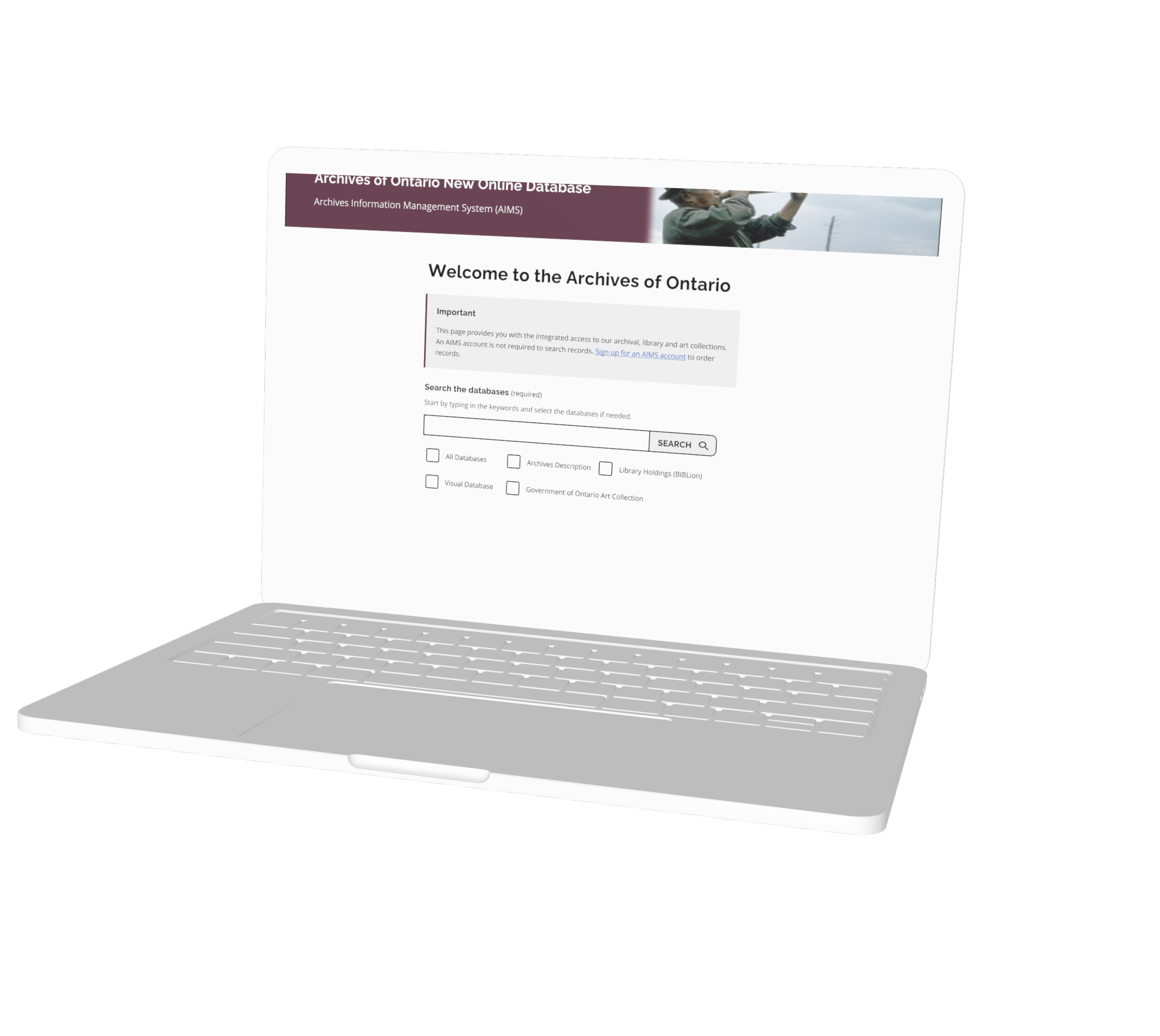
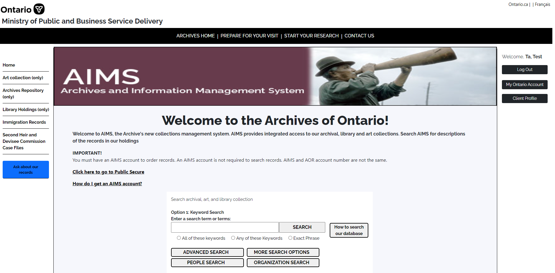
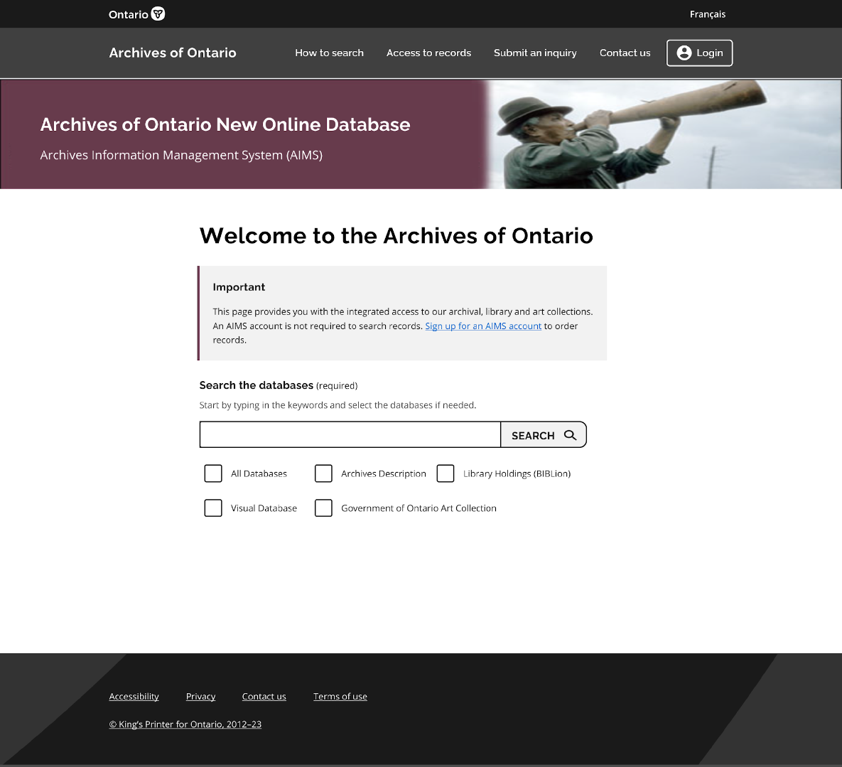
The Archives of Ontario’s new online records search database has experienced a significant amount of technical glitches and usability issues. The Archives of Ontario hoped to engage with the user researcher to together discover the problems and provide guidance on the redesign of the platform. Learn more about AIMS platform here.
The Problem
The development of 11 design recommendations for the upcoming releases of the website and 4 areas of improvement for the IT team.
The Outcome
Process
The Initial Problem
Archives of Ontario launched a new online records search database which integrates four previous databases into a one-stop shop in September, 2022. However, many complained about not being able to find the right records using the new online search database. Staff are reluctant to switch over to the new system.
Project Kick-off
To scope down the project and to align expectation between the design team and the client team.
Why?
What’s background of the project?
Why are we doing it?
Who’s doing it?
How are we working together?
Where do we collaborate?
What does success look like?
5 Ws
The Outcomes
Got to know one another and their roles
Exchanged the expectations and available expertise
Aligned project goals and research objectives
Shared thoughts / feedback on project objectives
Built online shared repository for documentation
Introduced design thinking process and relevant tools
Defined the success
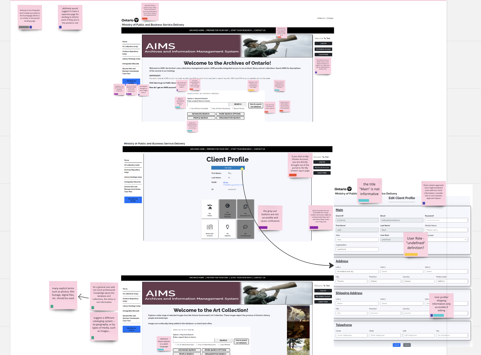
Heuristics Evaluation
To understand the functions, the mechanism and the potential usability issues of the platform.
Why?
Captured screenshots of the platform
Mapped out user flows
Identified potential usability issues on sticky notes
Categorized these issues
Came up with questions about the platform
The Process
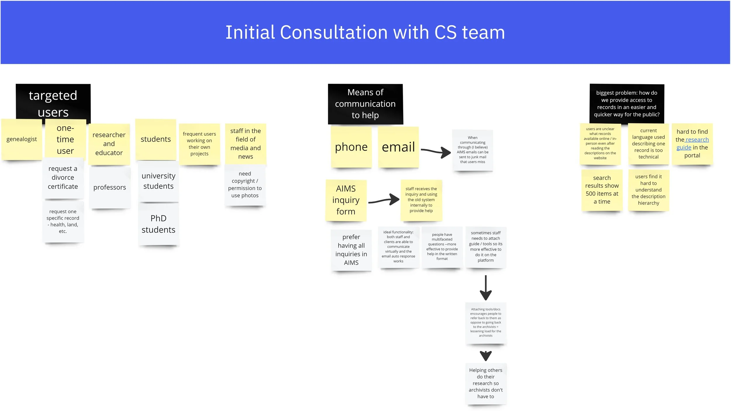
Initial Consultation
To get to know the lower level staff who’s working on this platform every day, and to understand what pain points the internal staff have been encountering.
The client services team specifically could also provide us insights about what aspects of the platform were complained the most by the customers.
Why?
Developed a deeper bond with the client services team and got them on board about supporting the user research process.
The Outcomes
Platform Walkthrough
To get our questions about the platform answered and to understand more about user flows.
Why?
The Outcomes
Got a wholistic view of the major targeted user flows and a general idea of an ideal user flows for internal stakeholders.
Define the Problem
Failing to provide the right search results and enough hint text for users to self navigate the site makes this new online platform not user-friendly. Therefore, the real problem lies behind is the usability issues. A user research is required to investigate what kinds of usability issues exist and how to tackle them.
“How might we understand and balance both the internal and external users’ needs and further improve the usability of the platform?”
Formulate Research Objectives
Before going into the research, collaborating with the project advisor on the team, we developed four research objectives.
To investigate what hinders users from completing a task from 4 aspects:
User interface elements
Content and language use
Accessibility issues
Users’ needs and motivations
Customize Research Methodology
Conducting only a user interview is not enough in this case, because the platform has already gone live and there were too many issues in parallel. I decided to combine 2 research methods to learn more about the platform and the user pain points.
Internal Interview
5 interview sessions
I decided to interview the internal stakeholders, because they are the people who know the system well and who interact with users directly. They can provide me with insights about the system and the existing pain points faced by internal and external users. Also, people feel more comfortable to talk about the issues in an interview session than in a workshop.
20 internal staff from 4 teams
60-min sessions with notes taken on Miro boards
Interview Findings
19
staff mentioned the new integrated system neglected the good features from the old system
13
staff mentioned there are many accessibility issues with the new system
15
staff mentioned the language used in the system contains too much jargon
Usability Testing
including not only professionals (3) but also general public users (11).
8 Industries
After knowing a little bit insights about the platform, I moved forward to do the usability testing to verify the existing pain points and also to understand which features were expected / preferred and which were not.
14 Sessions
public users came from various industries (IT, nursing, education, museums, library, government services, students, news/media) to ensure different perspectives got captured.
After recruited the participants, I worked with the client’s team to design the tasks for the sessions. The platform is relatively complicated and huge in scale, we did not have enough time to test every feature on the platform.
I also designed the note taking templates in Miro and invited subject matter experts from client team to participate in the note taking so that they got involved in the first hand experience witnessing users’ feedback and pain points.
Usability Testing Findings
Synthesizing quantitative data
8
error pages encountered by the participants
3/14
participants completed the tasks
5.4
search attempts on average to get to the result page
Synthesizing qualitative data in Miro
Four major areas of improvement
-
The search functionality is not matching users' mental model (e.g. Google)
The help text and call-to-actions are not prominent enough to help users navigate through the process
The layouts of the results page and the detailed record page are not well organized
-
The button names are not actionable
The content is not informative and contains too much industry jargon
Instructions and help text are not enough. Some do not stand out so can be easily missed by users
The search results are not showing the hierarchy and type of the records which causes confusion (fonds, series, etc.)
-
There is no clear hierarchical distinction between two navigation bars which causes users to accidentally go to external sites
Some buttons are not working as intended which do not take users to the right page
-
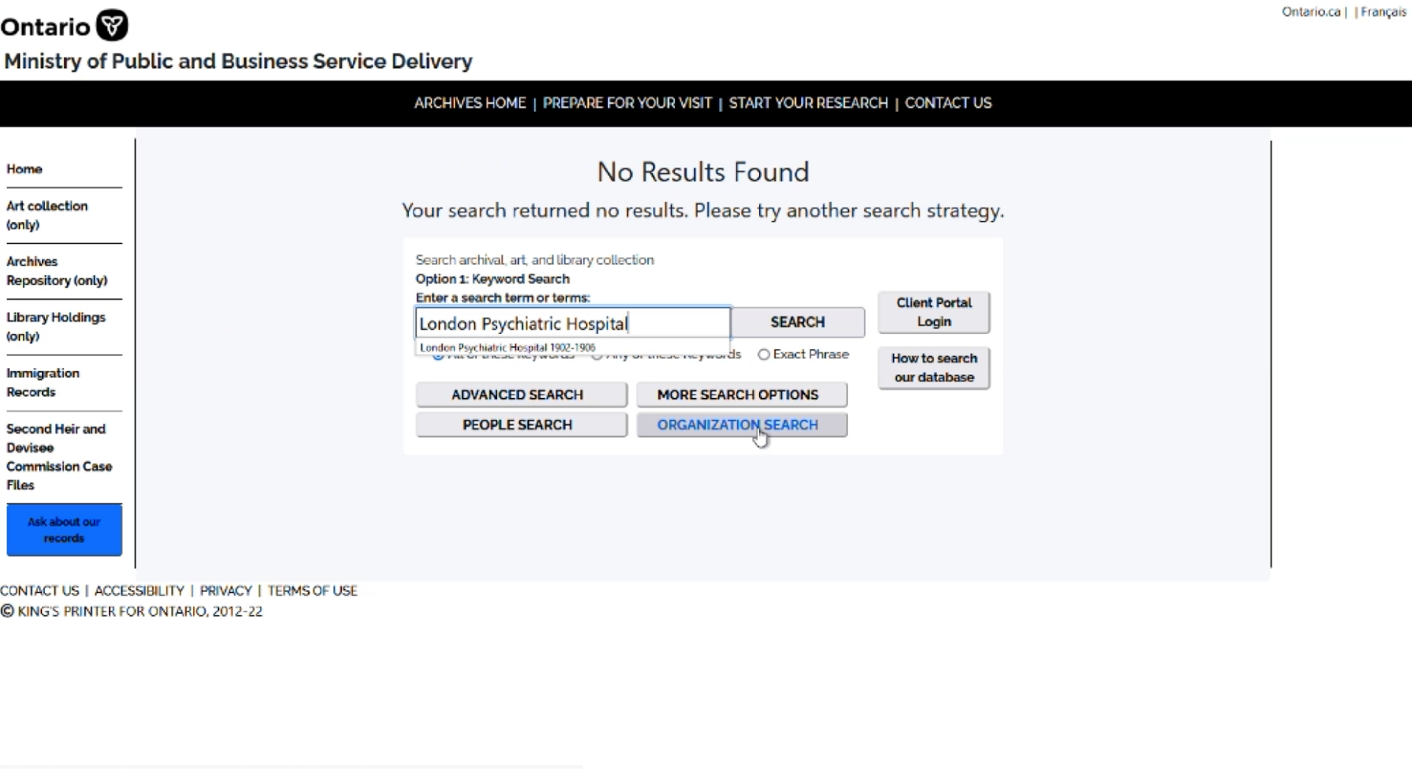
Technical glitches happen when users press "search“
The system time-out happens so frequent that it interrupts the user flow
“Ask about our records” button has low color contrast and is not placed in a salient position on the page
Research guides and relevant help resources are missing in AIMS and links in the research guides are outdated
Translate Data into Actionable Insights
After synthesizing both quantitative and qualitative data, the design team came together to develop the design recommendations for the team to review and can be acted as a design guide moving forward.
Design Recommendations
100
user pain points identified
recommendations synthesized
Implemented the recommendations
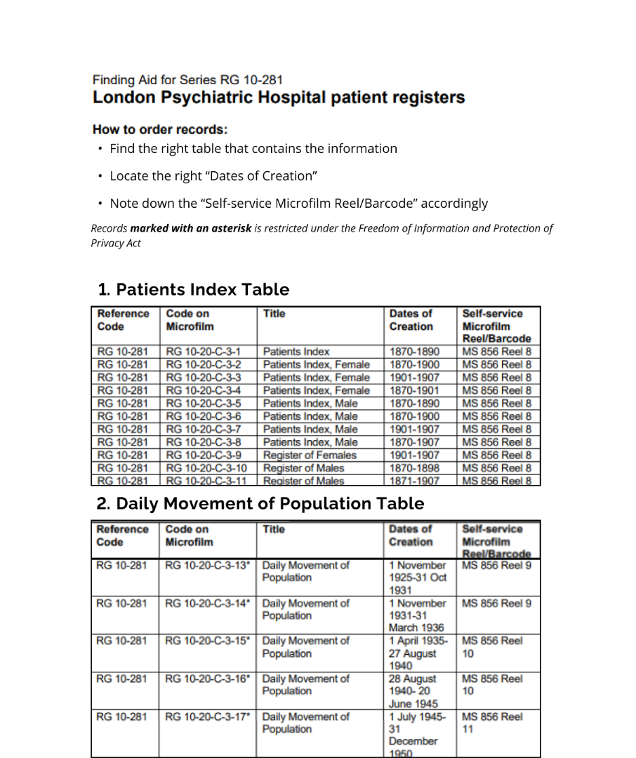
Break down large trunk of text into digestible amount of information on each screen.
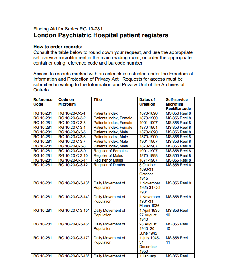
For example, for the table on the right, break down the table into different tables with different themes and titles for people to better locate information.
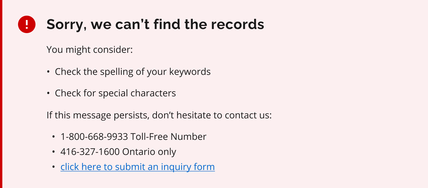
Rephrase the error message and redesign the layout of the error pages.
Explore the information architecture of AIMS (what should be included in the navigation bar).
43
design decisions informed
11
Study Limitations
1
No time to do more iterations on the design recommendations
Next Steps
2
Unable to reach out to more experienced users due to the long approval process
3
Inferences cannot be drawn about the prevalence of findings beyond
the sample
4
Not enough time to test all the search databases
The project will continue, keeping the study limitations in mind.
Next steps include designing usability testing for different task flows and involving more experienced users through Archives of Ontario network after communication team approval. The team will then refine design recommendations and prototypes based on feedback.
Conclusion
This user research study is just a beginning of the journey of the continuous improvement of the platform, AIMS.
I outlined the next steps for my colleagues.
The next steps after this study include the following:
Align on a feasible path forward for addressing pain points.
Identify ways to support the clients’ team.
Identify any additional stakeholders to include in future engagements.
Review and identify ways to apply the Digital Service Standard to existing products.
Lessons Learned
Sometimes what you see on the surface is not the real problem.
Identify the right stakeholders before kicking off the project.
Choose the right research methods, don’t just follow the convention.
As a user researcher, I should be comfortable dealing with the silence in a usability testing session. Sometimes silence helps because it gives the participants time and space to work on the tasks and to think of the answers to say.
Visuals and screenshots are powerful tools. Visualizing the design recommendations using some sample prototypes helps to illustrate the ideas and to get buy-ins.

