Information Architecture Redesign of CIMMO
Redesigning the website’s navigation system for an Ontario non-profit organization, Chartered Institute of Marketing Management of Ontario (CIMMO).
Timeline
January - April 2023
(3 months)
Team
Charley Yip, Rebecka Ferraro, Yuhao Wang, Anqi Zhu, Erxun Ta (me)
Tools
Figma, FigJam, Excel, Optimal Workshop
My Role(s):
User research, workshops facilitator, data analysis
User research plan, playback presentations, Usability testing
My Contribution
The only chartered institute of Marketing in Ontario, founded in 1988. It aims for providing marketing students with accredited study programs, young professionals with access to career site and marketers with chances to network.
What is CIMMO?
Overview
The website looked outdated and not accessible
Google analytics showed the user registration rate has been decreasing
The navigation of the website was not intuitive
The Problem
A comprehensive heuristic evaluation the website
User testing dedicated to the navigation of the website
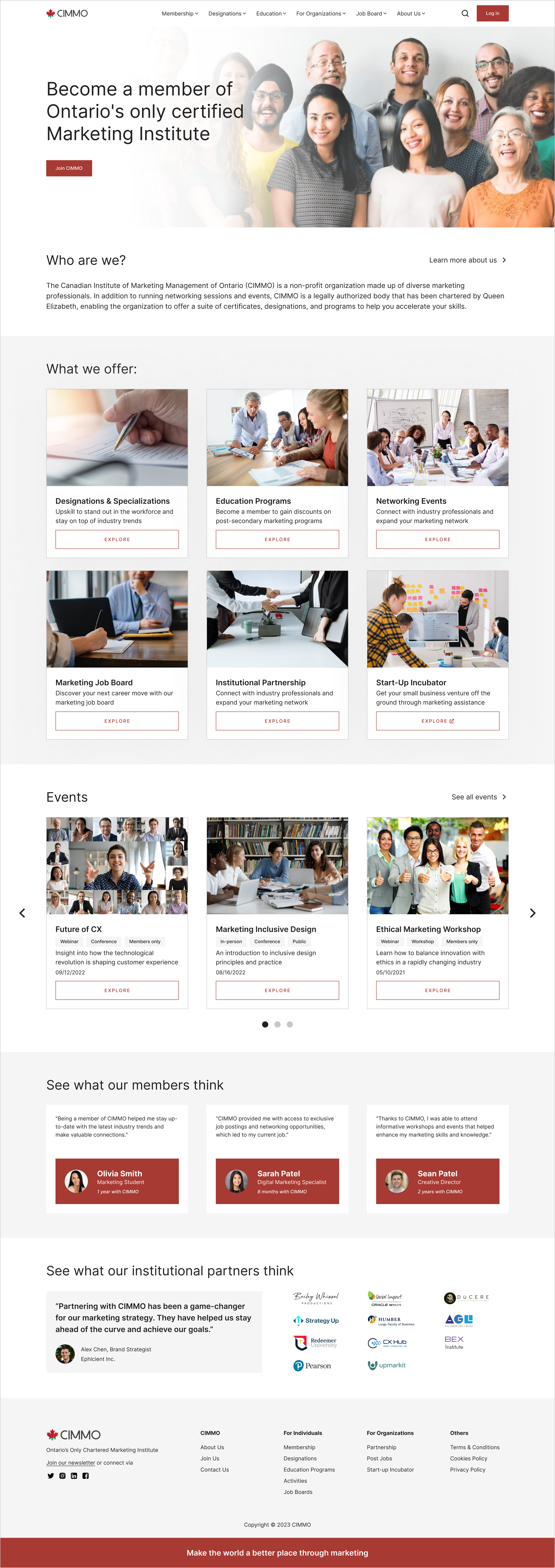
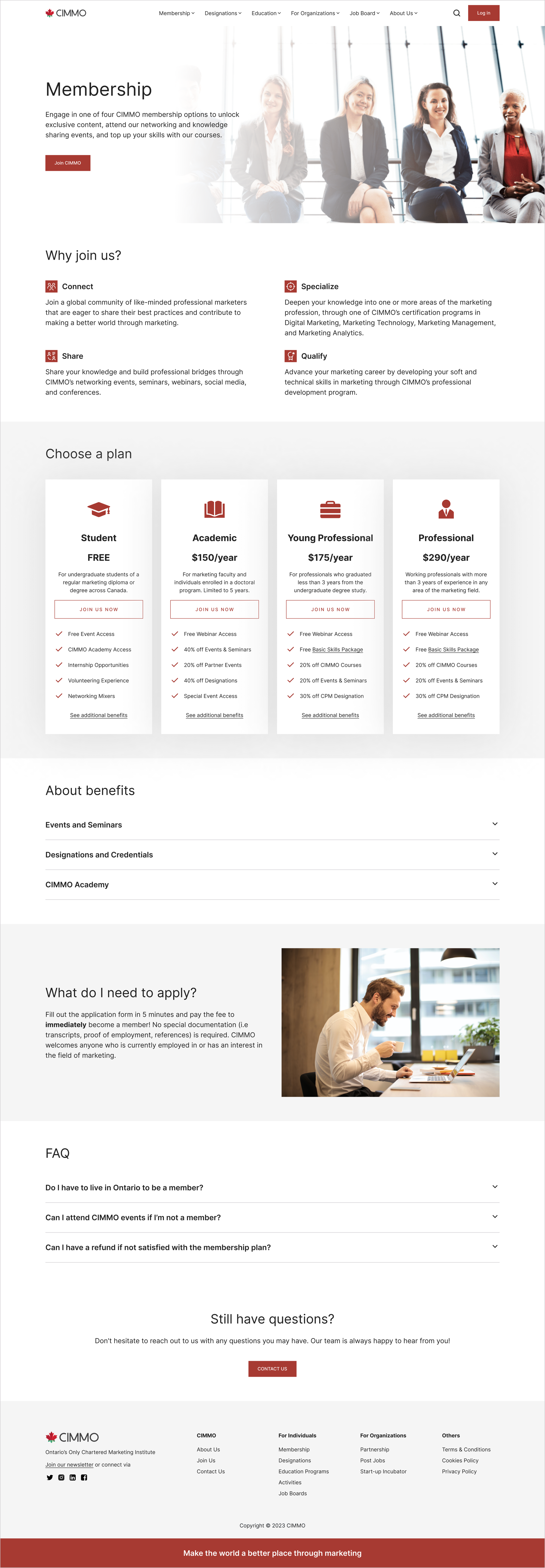
UI Revamp of the website homepage and membership page
The Outcome
The president of CIMMO, Dr. Youssef, would like to attract more Gen Z and millennials (young professionals and students) to this organization by enhancing the UX of the website.
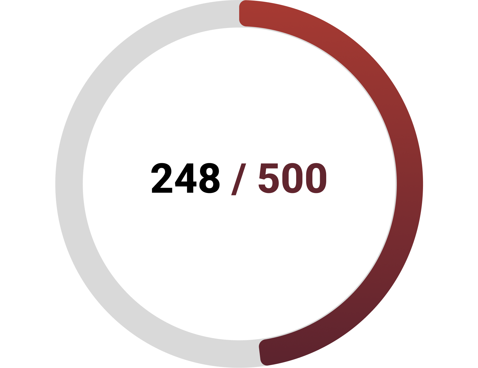
And to increase the membership from 248 to 500 members in 2025.
In pursuit of stakeholder objectives, we delved into the problem space, employing diverse user research methods to enhance the overall user experience.
The Goals
Empathize
Heuristics Evaluation
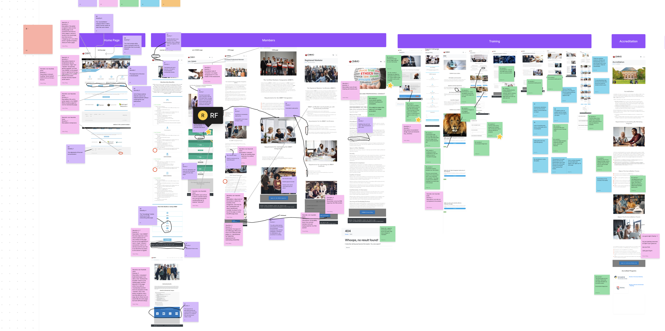
By conducting a heuristics evaluation, the team got familiar with the website content, structure and major functionalities while also found out lots of usability issues as denoted on the FigJam board. Major problems include but not limited to, accessibility issues (low color contrast, non-intuitive icons) and inconsistent design ( different colors were used everywhere, inconsistent design style and page layout).
Preliminary Interviews
Since the client wanted us to target more Gen Z and younger users, we selected both marketing students (graduates) and young professionals to interview, mainly to ask them what their motivations behind joining a marketing organization like this one. Most of them mentioned about having an official platform to network, to find better jobs or to learn more about marketing knowledge. While asking them what prevented them from joining the organization, we found out that their concerns were — the organization seems to be not legit by looking at the branding and design.
Usability Testing
While understanding the necessity of rebranding the website, we also conducted usability testing to further uncover user pain points. We created 6 tasks according to the major functionalities of the website and found out that, participants were majorly confused and hesitant in the tasks of joining CIMMO membership and getting designation.
Define
Define the scope
We decided to focus on rebuilding the navigation system for 2 user flows.
As we can tell from the research phase, there were so many usability problems associated with the website. Due to the time and resources limitation, we decided to focused on redesigning the navigation system, especially considering two major user flows, joining membership and getting the marketing designations. Since the navigation system is the basic structure of the website, most users were turned away due to being unable to locate information using the menu.
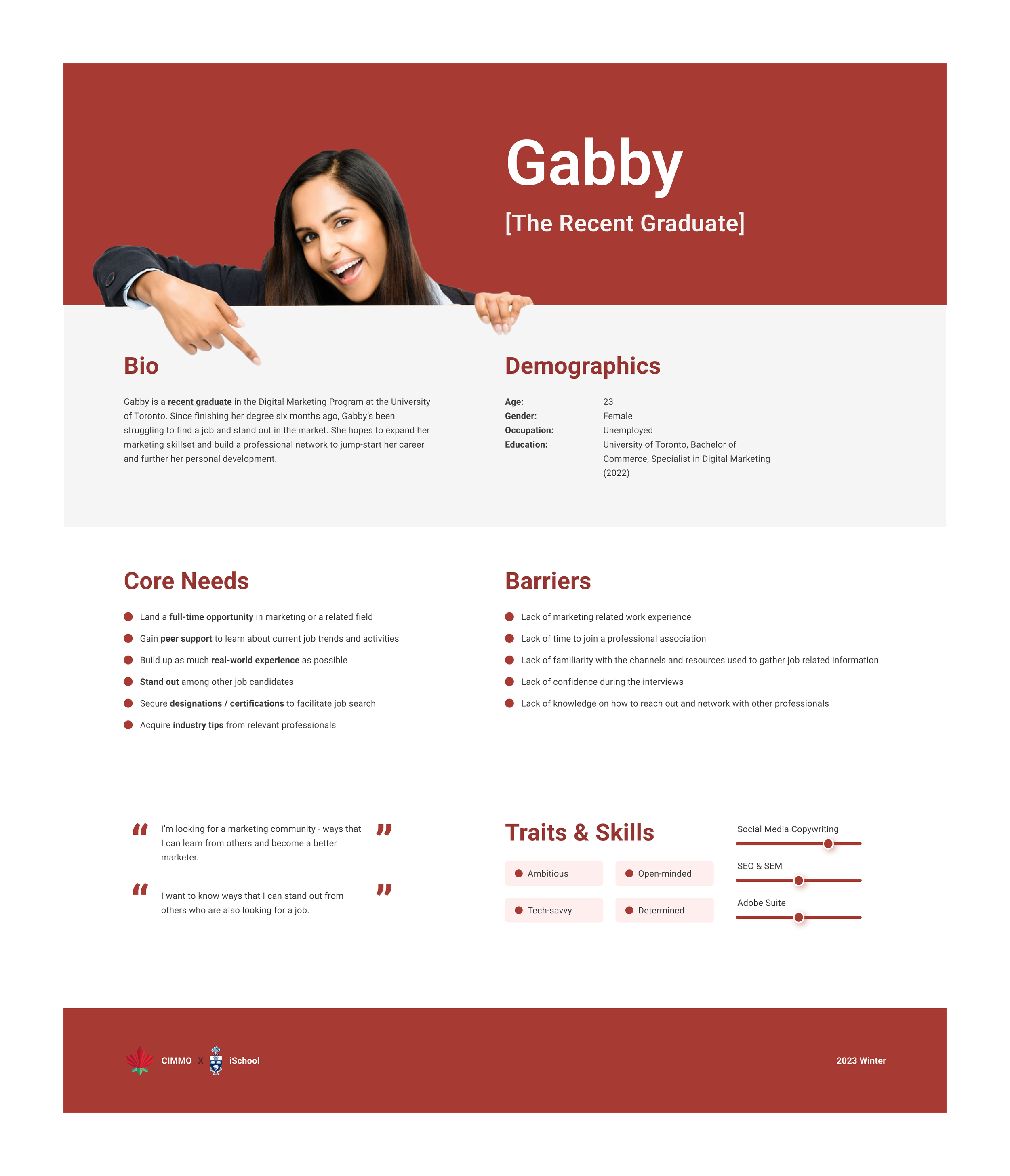
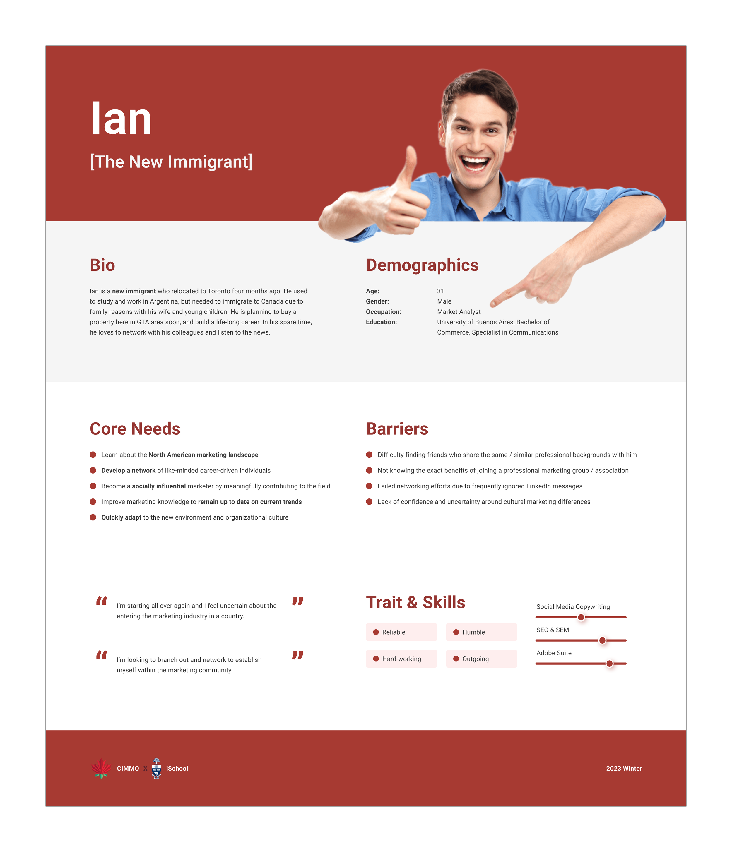
User Persona
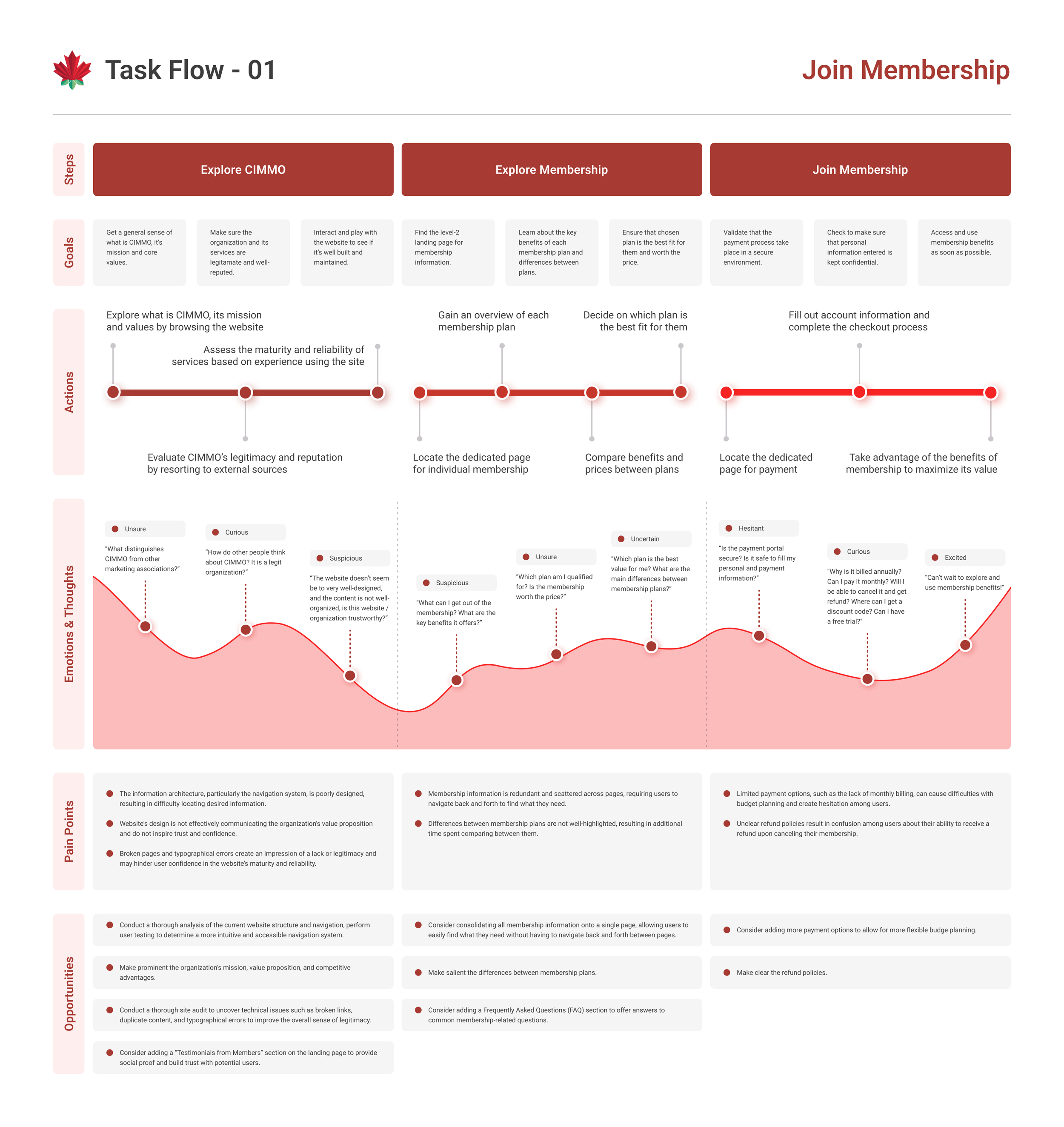
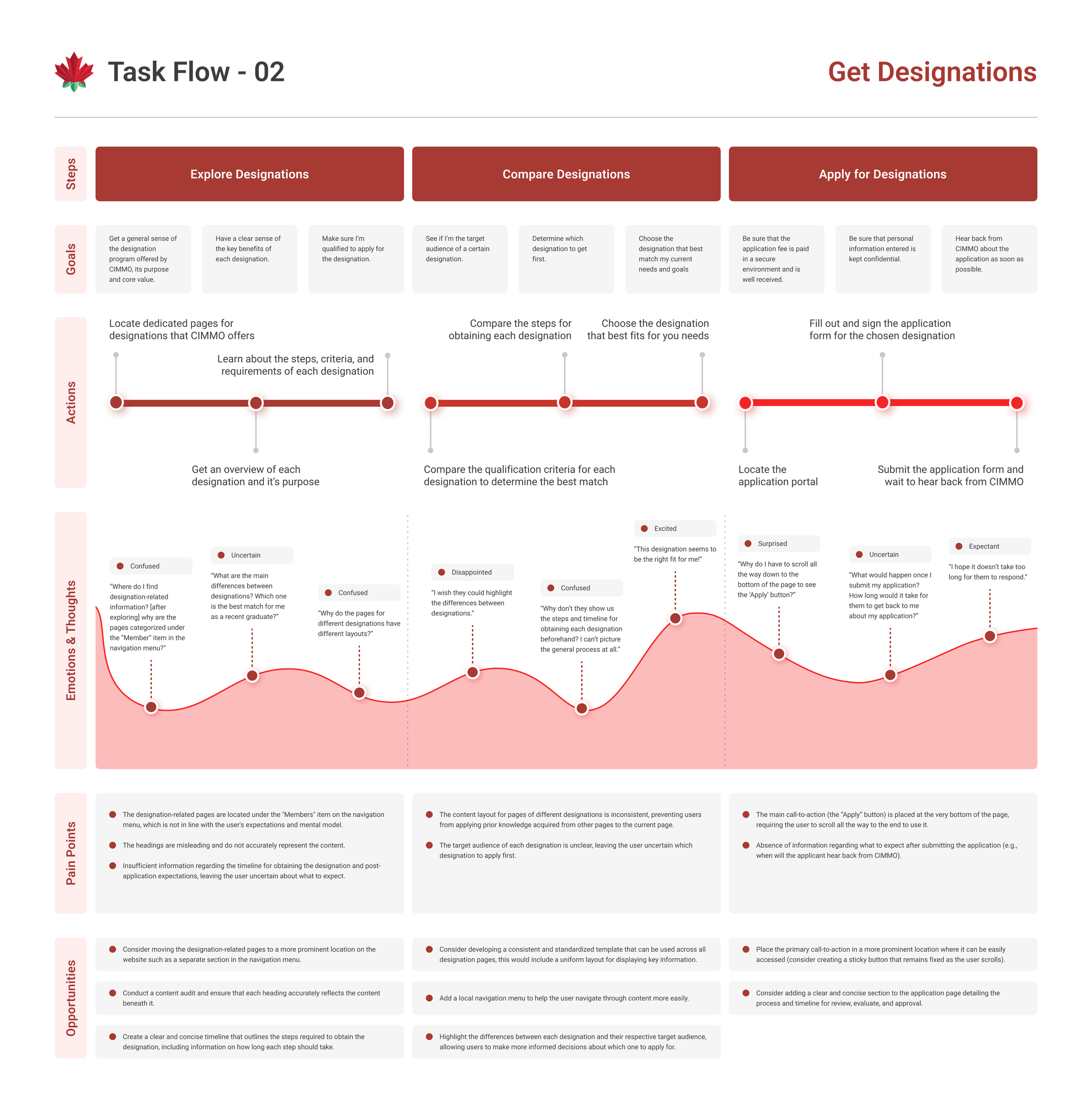
User Journey Map
Testing
Open Card Sorting
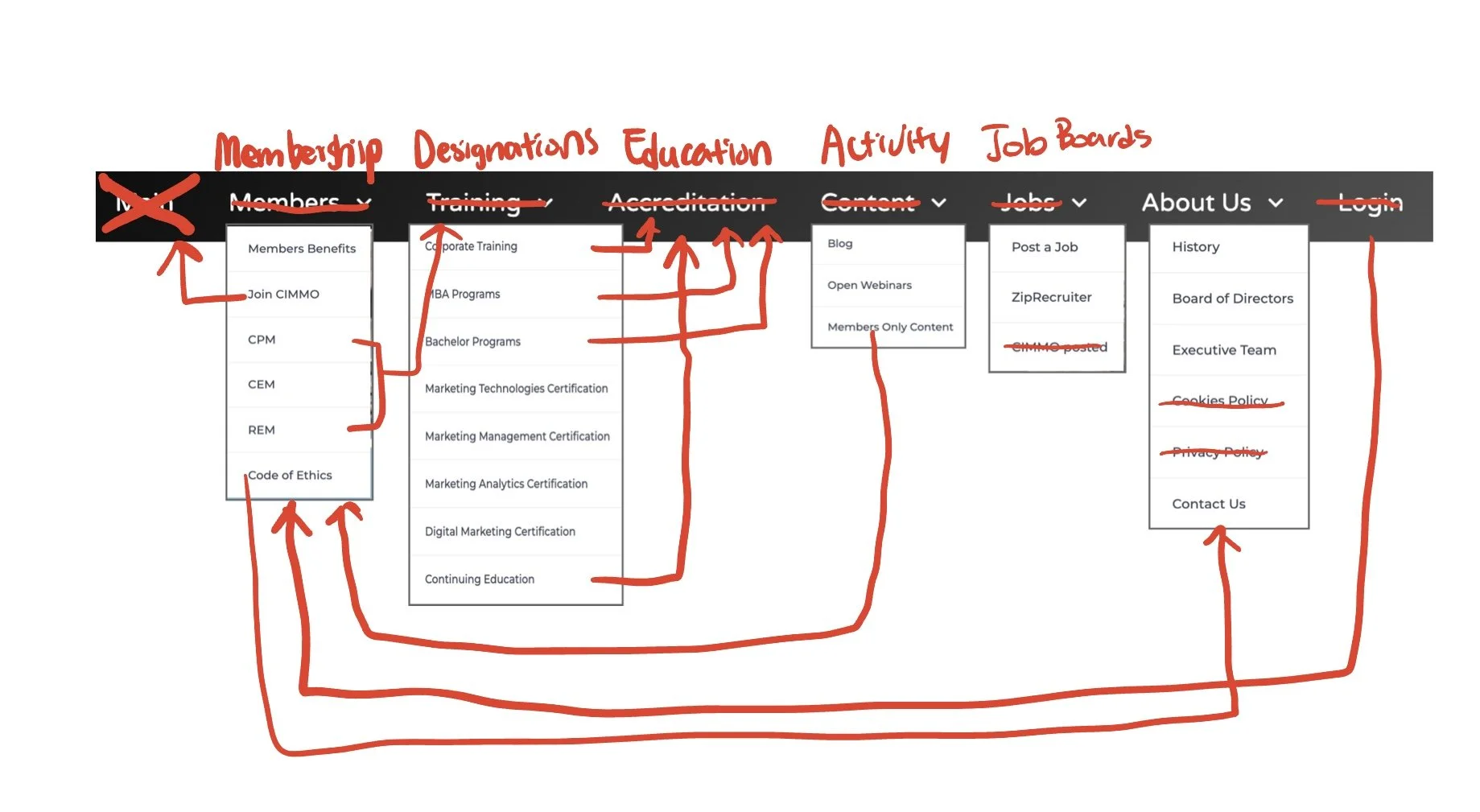
We decided to conduct an open card sorting activity on Optimal Workshop to determine users’ preferences over the groupings of different menu items. We used open card sorting method instead of closed sorting, because we found that we may also need participants to propose their ideal names of groups for each category.
We presented all these menu items to the participants, one item on each card, 34 cards in total and asked participants to group them according to their own understanding of the items.
Card Sorting Findings
Similarity Matrix
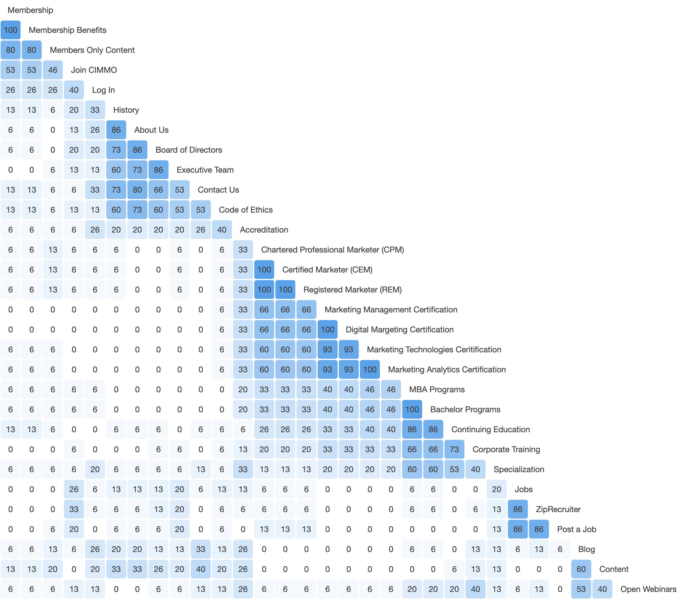
The similarity matrix helps us to identify strong cards pairing and potential groupings. The numbers on the matrix shows the proportion of the participants who grouped 2 cards in the same category.
We found that participants tended to group labels that have explicit association in words, such as “Members” and “Members Benefits”, “Marketing Management Certification” and “Digital Management Certification”, “MBA programs” and “Bachelor Programs”.
We decided to note down the combos that have the number 100 and make sure in the new groupings, we have these combos grouped together accordingly.
Dendrogram (Best Merge Method)
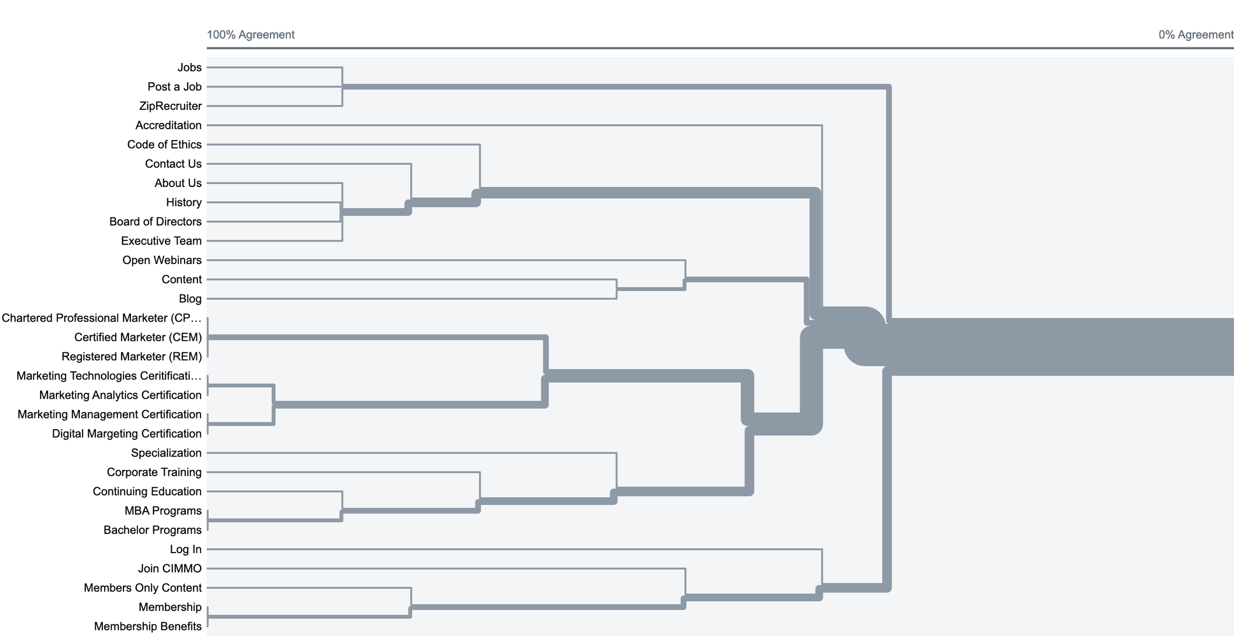
This dendrogram depicts the potential groupings based on the existing factual relationships created by the participants. It provided us a reference on how different items are grouped.
Treejack Testing
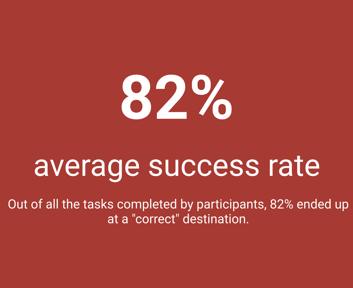
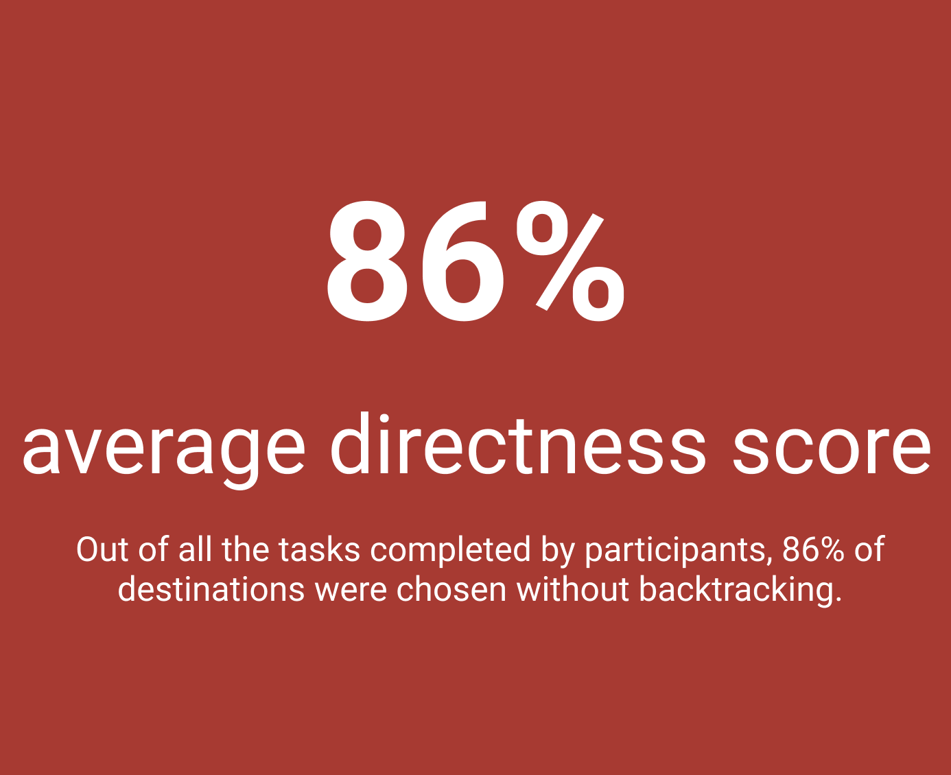
Based on the result from the open card sorting, we built a preliminary treejack (menu). In this treejack testing, we provided participants with 6 tasks and asked them to locate information using the new treejack on the right side below.
Treejack Testing Findings
Task-specific Findings
-
90% participants reached the right destination, while 10% chose “Membership” despite “Join CIMMO” is more prominent on the menu. Consider having join CIMMO under “Membership” and adding “Log in” to the primary navigation.
-
40% participants failed to reach the right destination. This one is a bit tricky because the right item is embeded in the third level of navigation. Consider adding more affordances on the webpage to inform users what category the “marketing technologies designation” fall under.
-
Only 7% reached “MBA programs” instead of “Continuing Education”. Consider breaking down content in “Continuing Education” and moving them to either “MBA Programs” or a new category “Graduates Programs”.
-
Most participants went to “About Us” instead of “Activity”. We might consider merge these two categories together.
-
This one seems to be very straightforward for the participants.
-
7% reached to “About Us” instead of “Contact Us”. When building the website, consider having contact info on both About Us and Contact Us pages.
IA Redesign
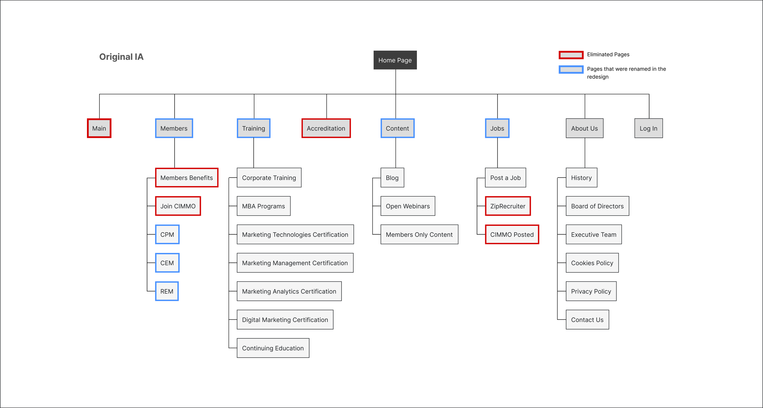
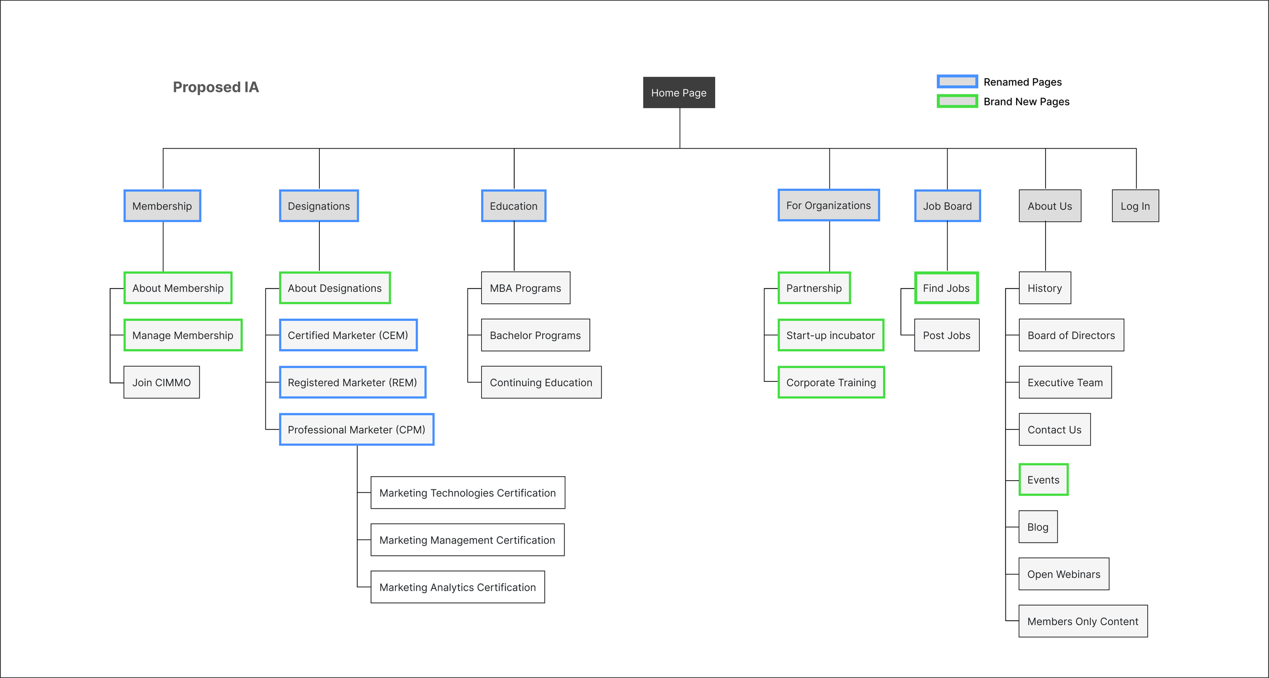
Before & After Site Maps
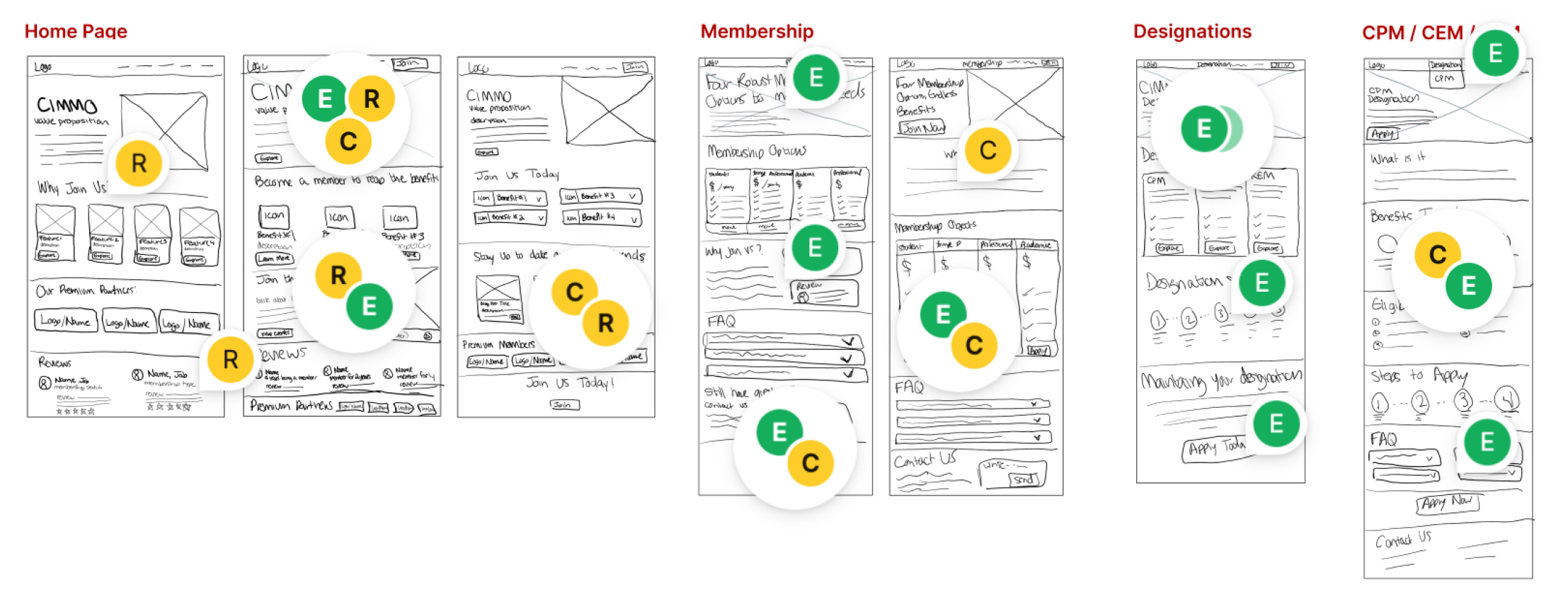
Mock-ups
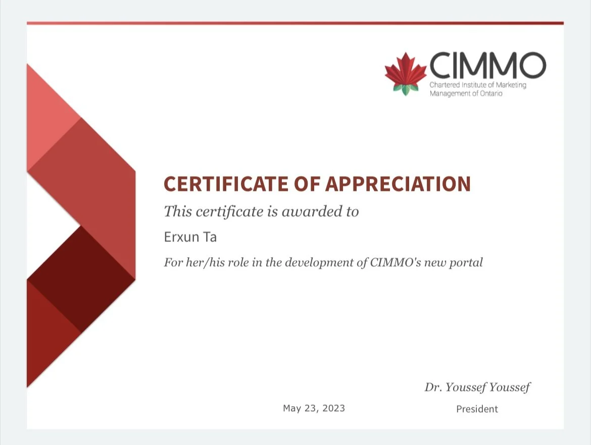
Recognition
Presented the design process, research insights and final design to the client’s team
Received recognitions and compliments on the innovative ideas, new information architecture proposal and the new design.
Reflection
As a UX designer, constantly defending my decisions is not something extra but is part of my job. I have to be able to justify my decisions and solutions so that I can get buy-ins and more people on board to implement the ideas.
When analyzing treejack testing data, I have to consider whether users can really locate the item in the real-life scenarios. Sometimes they might not be able locate it during the testing, just because the items were embeded into too many layers and when doing the test, participants might not want to bother thinking. However, in real-life scenarios, if they really need to look for that item, they will read through the webpages and they are able to locate it.

