Designing a group formation app: help students to form the course project groups faster
Team & Roles
The Innovation Hub:
Research & Design
Skills
User Research
Product Design
Timeline
Oct 2021 - Dec 2021:
2 months
Tools Used
Figma & Miro
Maze
Table of Content
Overview
Background, Problem, Final Solution
Research
User Research, Competitor Analysis, Theories Overview
Design
Ideation, Low-fi, Mid-fi, High-fi
Testing
Usability Testing
Reflections
Future Enhancements, Learnings
Introducing Nest to you
Overview
When Covid-19 hit Europe in February 2020, students had to switch to online courses to stay safe. Dutch scholars studied how online team projects affected students' class performance. The results revealed students faced challenges in staying connected with classmates and lacked confidence to seek help during online courses (Kalmár et al., 2022).
Kalmár, É., Aarts, T. F., Bosman, E., Ford, C., De Kluijver, L., Beets, J., Veldkamp, L., Timmers, P., Besseling, D., Koopman, J., Fan, C., Berrevoets, E., Trotsenburg, M., Maton, L., Van Remundt, J., Sari, E., Omar, L., Beinema, E., Winkel, R., & Van Der Sanden, M. (2022). The COVID-19 paradox of online collaborative education: when you cannot physically meet, you need more social interactions. Heliyon, 8(1), e08823. https://doi.org/10.1016/j.heliyon.2022.e08823
Background
Problem
After the pandemic arrived in March 2020 in Toronto, we started hearing concerns about students struggling to find suitable group members for online classes, particularly in the UX program at the University of Toronto. This was a significant issue since many courses in this program heavily relied on group projects.
To continuously improve students’ experiences in school, we started to seek for solution that will help students find the suitable group members for their academic group projects.
Solution
After a series of research (see detailed research findings), a mobile application (see detailed design process) was designed to increase the speed of forming groups.
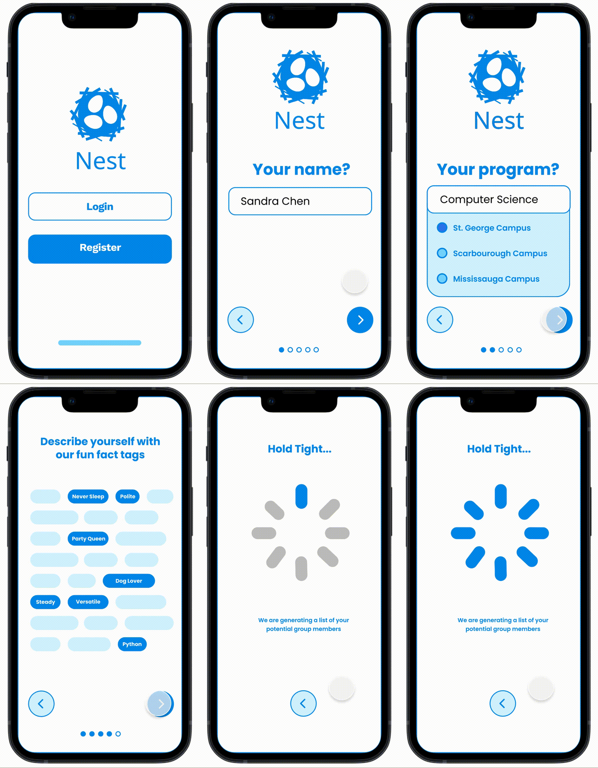
Onboarding
Log in via University’s verified student portal
Provide course details and group forming preferences
Smart algorithms to provide “best match”
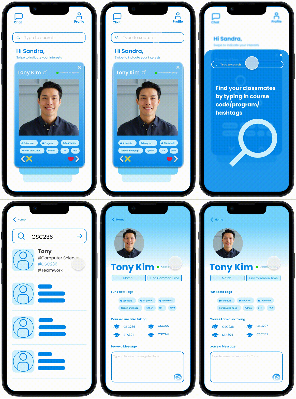
Search and Match
Search for students with ideal criteria
Search for available students (open to groups)
Filter out unsuitable students
Research
User Research
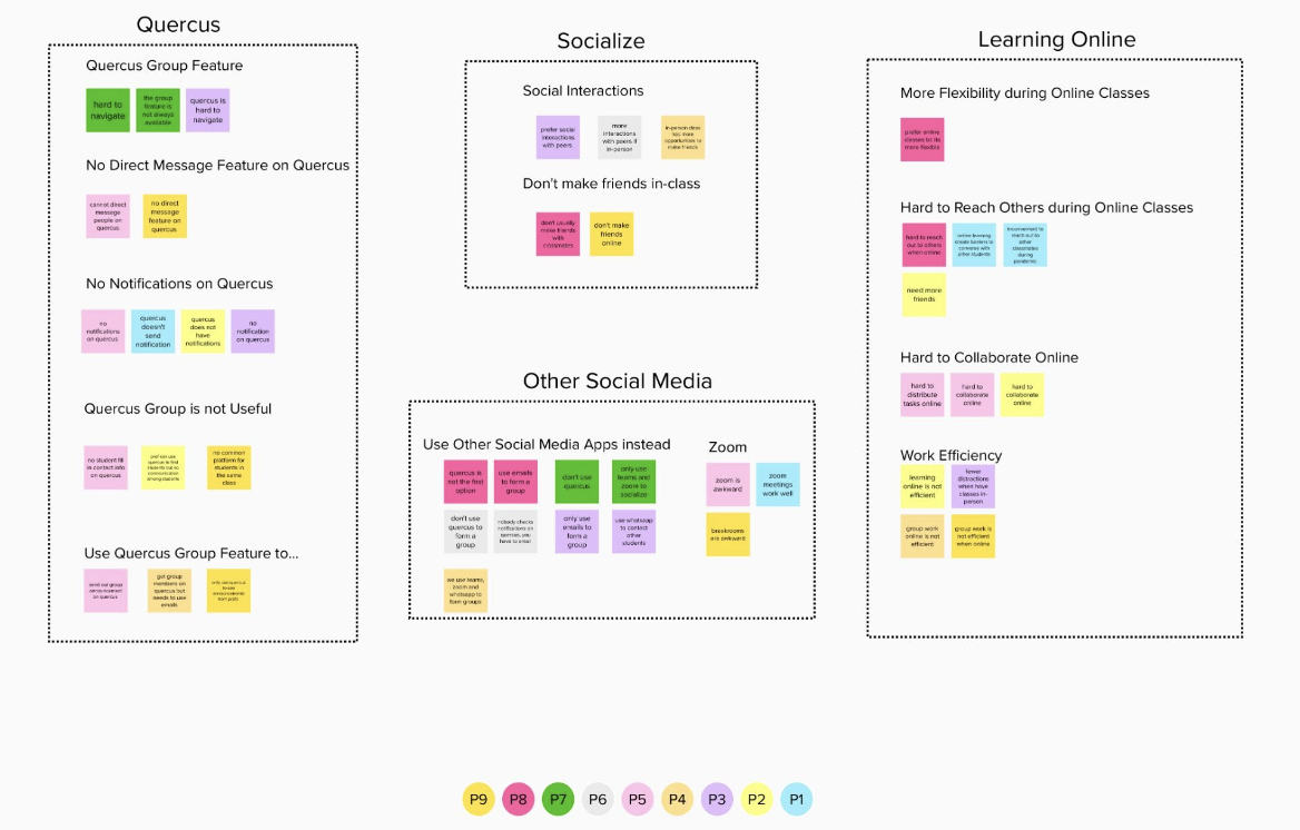
We interviewed 9 participants to know the context of finding a group member. We synthesized four major pain points:
The school’s official centralized learning platform, Quercus, has a “Group” feature / tab but did not work as intended.
Students rarely socialized with one another in class so it was hard to find a familiar group member.
Students could hardly collaborate online, lack of efficiency, which caused frictions during group projects.
Different students used different social media platforms, which made it hard to find available group members.
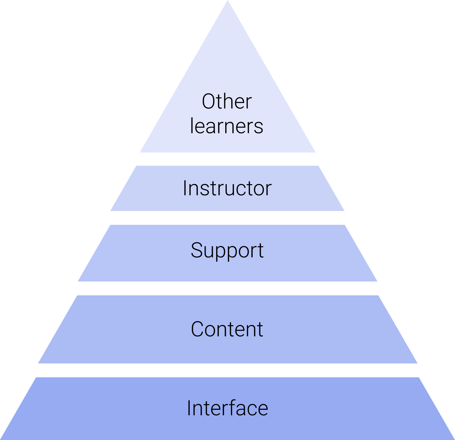
Pyramid Interaction Theory
This theory illustrates that in order to increase students engagement and virtual collaboration, one needs to interact with these elements in sequence. For this project, we will only be focusing on the interface level [1].
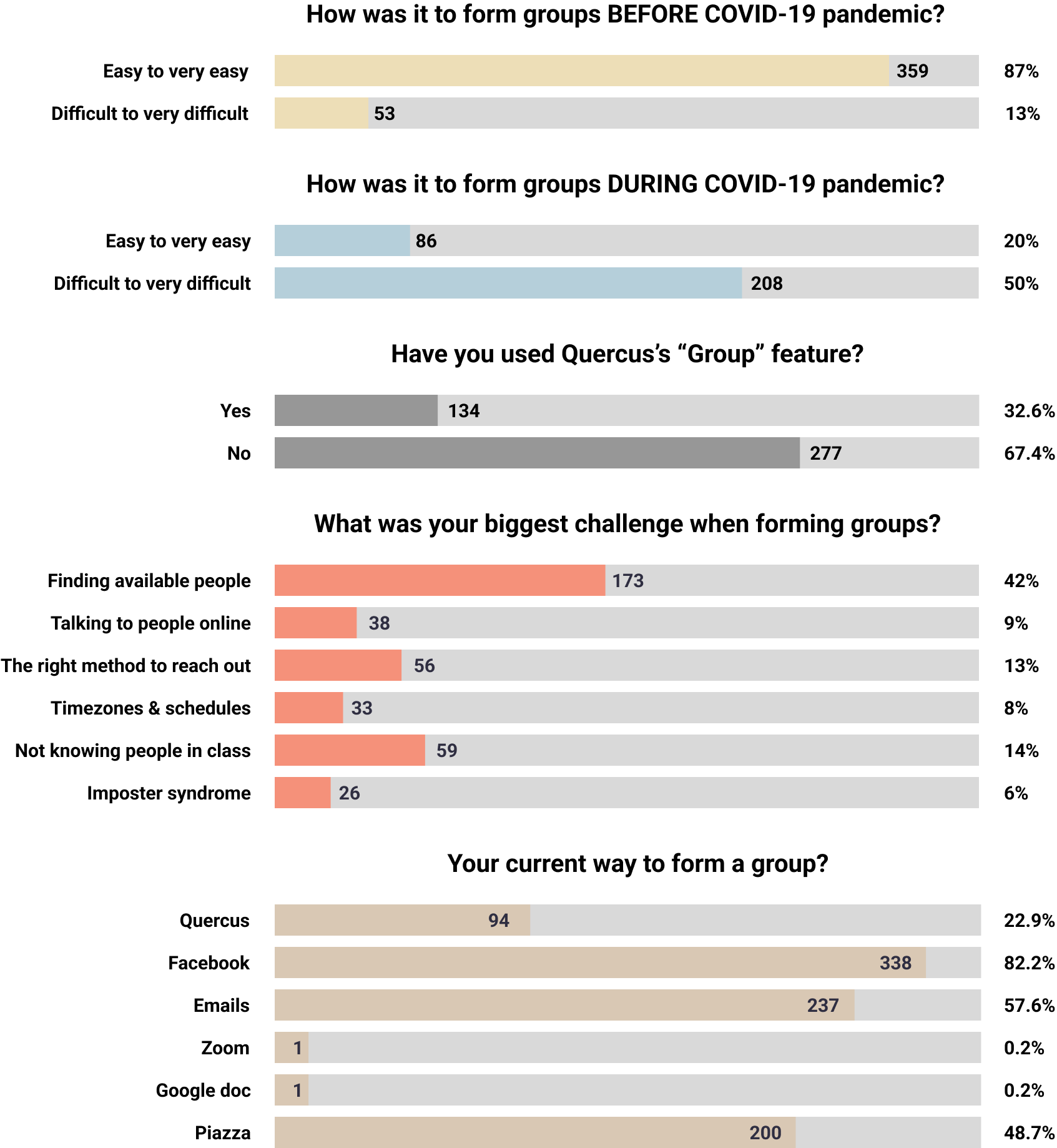
In order to get the insights in a short amount of time, we also surveyed 412 students from the University.
The survey was designed to validate the generated pain points above and to know more about their current ways to form groups.
Results showed that students experienced more challenges in forming groups during the pandemic.
We also gathered the most popular options students would choose when forming groups.
Competitor Analysis
After reviewing interview notes and survey responses, I analyzed the landscape of the group formation platforms. I selected 4 most popular platforms that students are using currently according to the interviews and the survey. The analysis revealed what the current popular group formation method lacked comparing to other group making apps.
Through our research and analysis, it became evident that students are in need of one centralized mobile app resembling social media. This app would enable them to enhance interactions with classmates and subsequently facilitate group formation.
Virtual Learning Theories Overview
I am not an educator, so in order to make the redesign professional and effective, I decided to conduct literature reviews on existing virtual learning engagement studies. I finally selected 2 theories below that can serve as a guidance for the redesign.
Belbin’s Team Role Theory
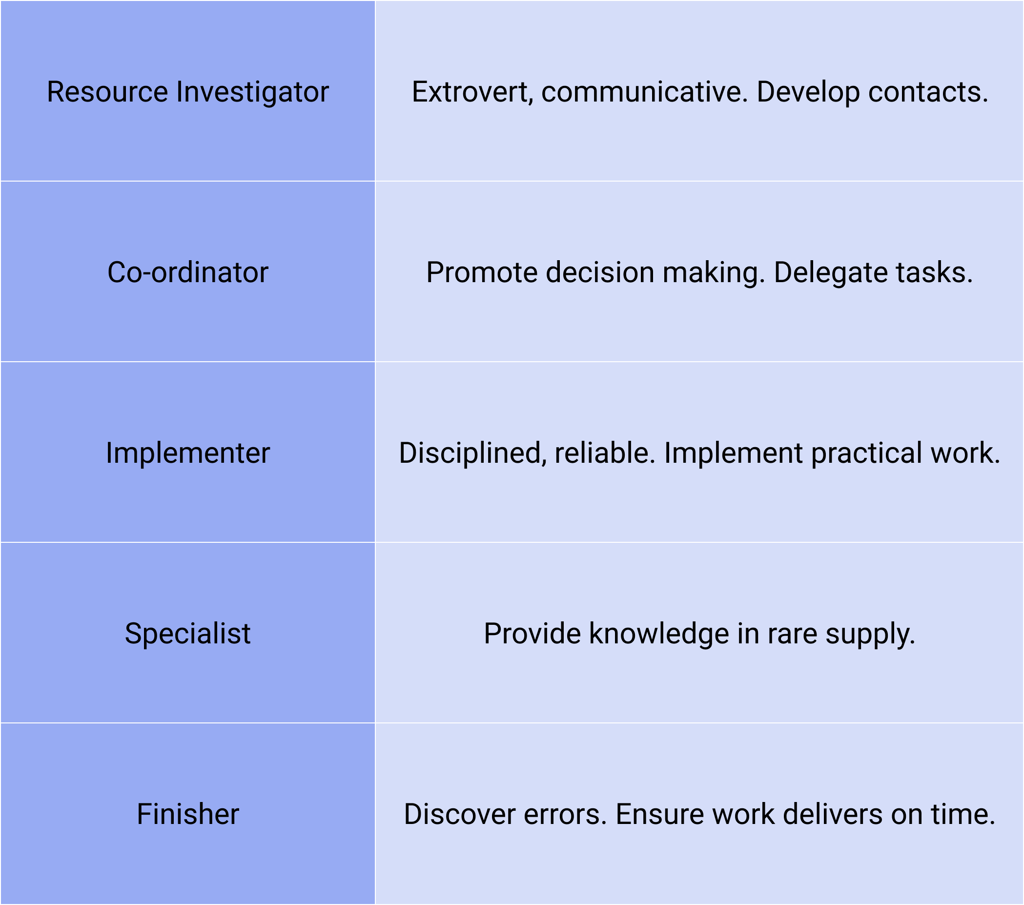
Dr. Meredith Belbin, the expert in team management and industrial training, advocated that different people should have different roles in an effective team. Here I selected 5 roles that are suitable for an academic group project. Students can decide on the roles preference before forming groups[2].
[1] Brown V.A. In: Transdisciplinary Theory, Practice and Education: the Art of Collaborative Research and Collective Learning. Fam D., Neuhauser L., Gibbs P., Cham, editors. Springer International Publishing; 2018. Reflections on collective learning: open and closed; pp. 275–287.
[2] https://www.belbin.com/about/dr-meredith-belbin
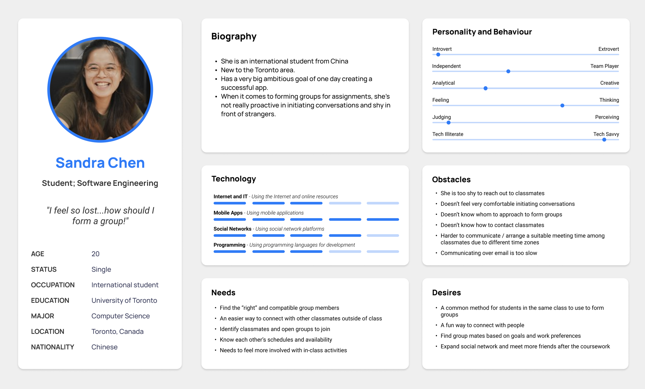
The typical user group that we were targeting for this phase (based on the research and analysis above)
Design
Ideation
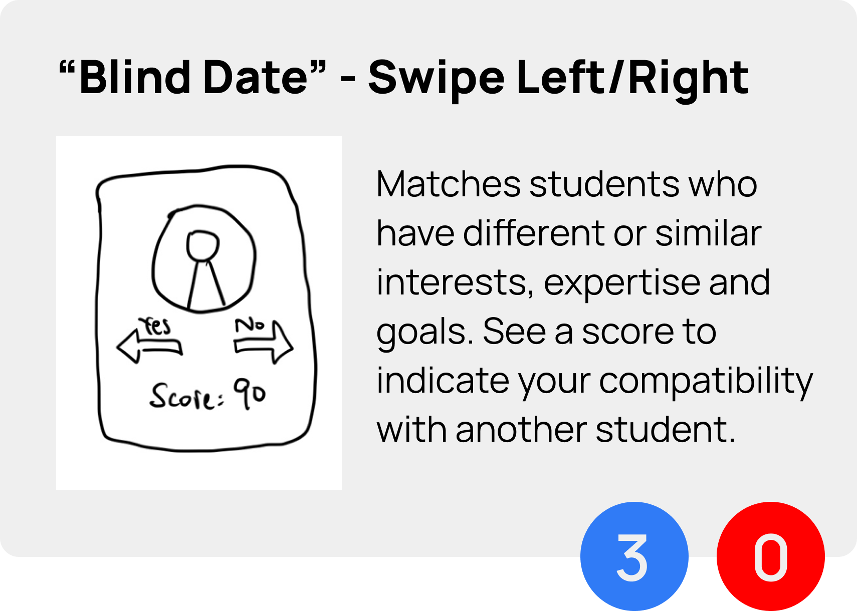
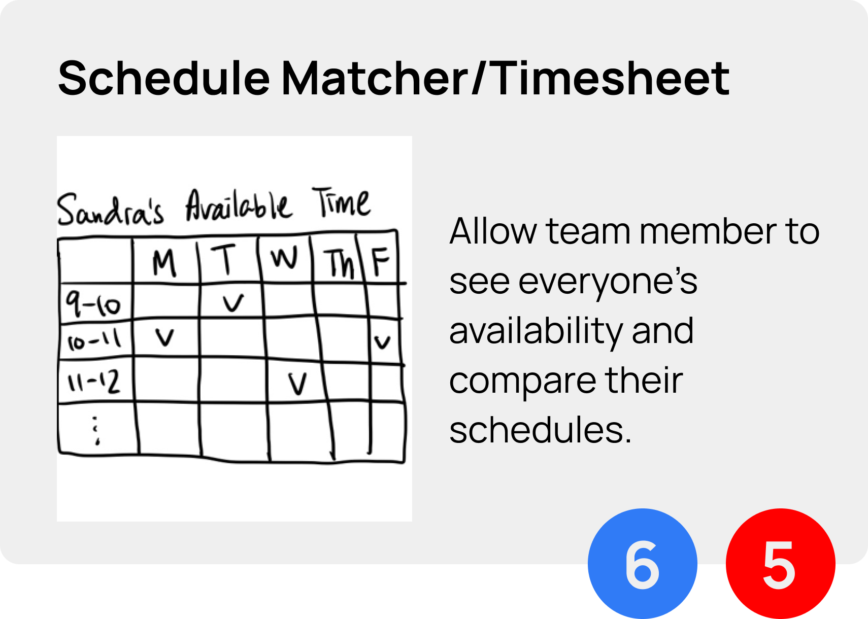
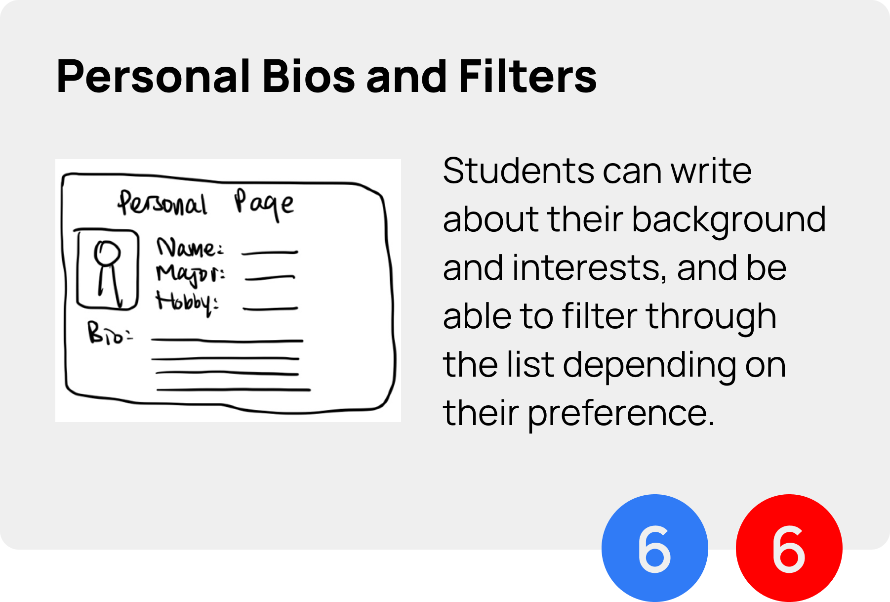
After understanding the problem space, all of us had some ideas in mind. We had a quick ideation session to ensure everyone’s ideas got heard and incorporated. We then voted for the most feasible (red) and the most impactful (blue). These are the 3 ideas that the team chose to go for.
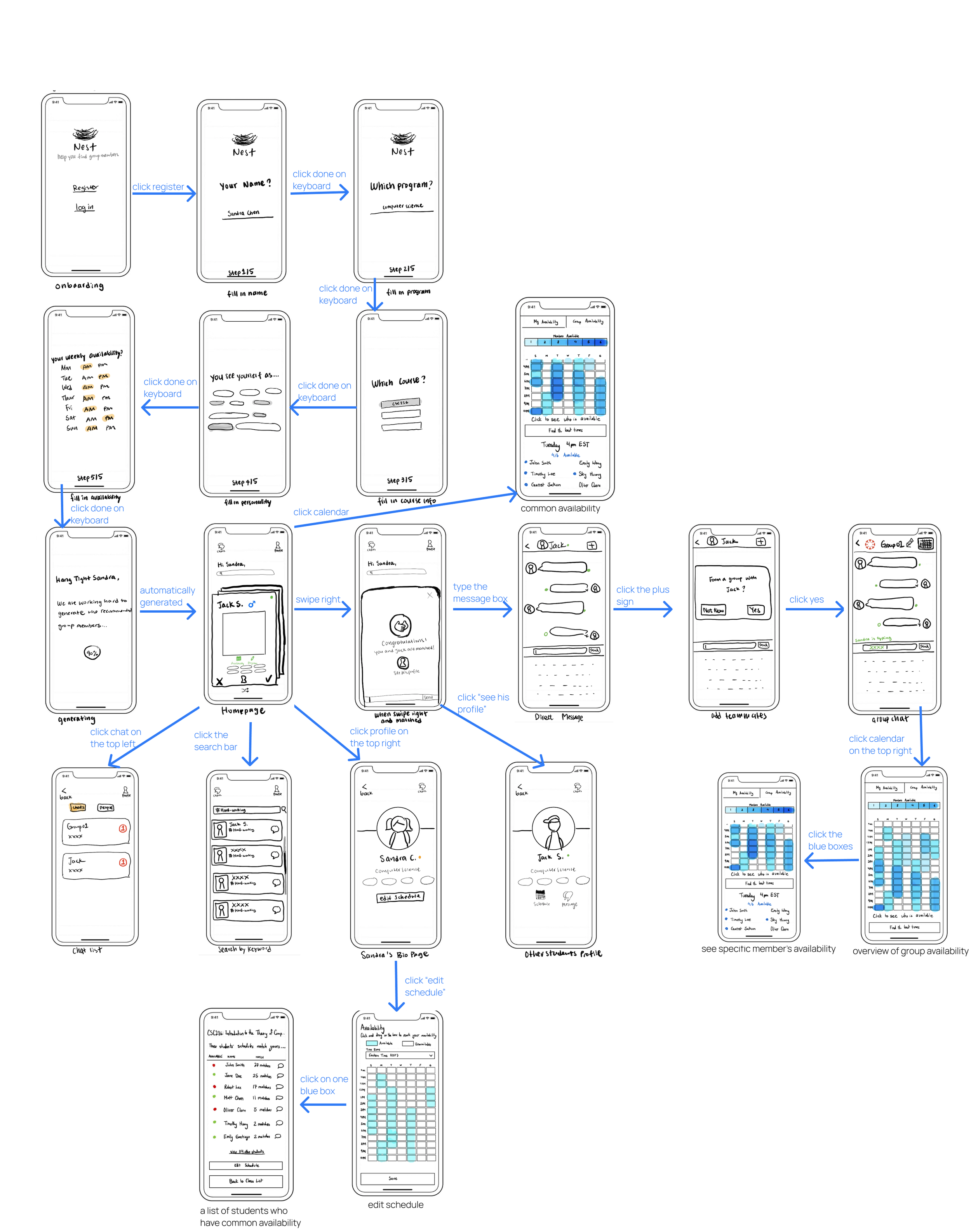
We first sketched out the low-fi screens and connected them using the storyboard format.
Then, we tested the low-fi version, mainly to validate if the user flows made sense (any missing steps or screens?)
Low-fi Storyboard
Onboarding
Functionalities
High-fi Prototype (Final)
Still in develop, will post it here soon.
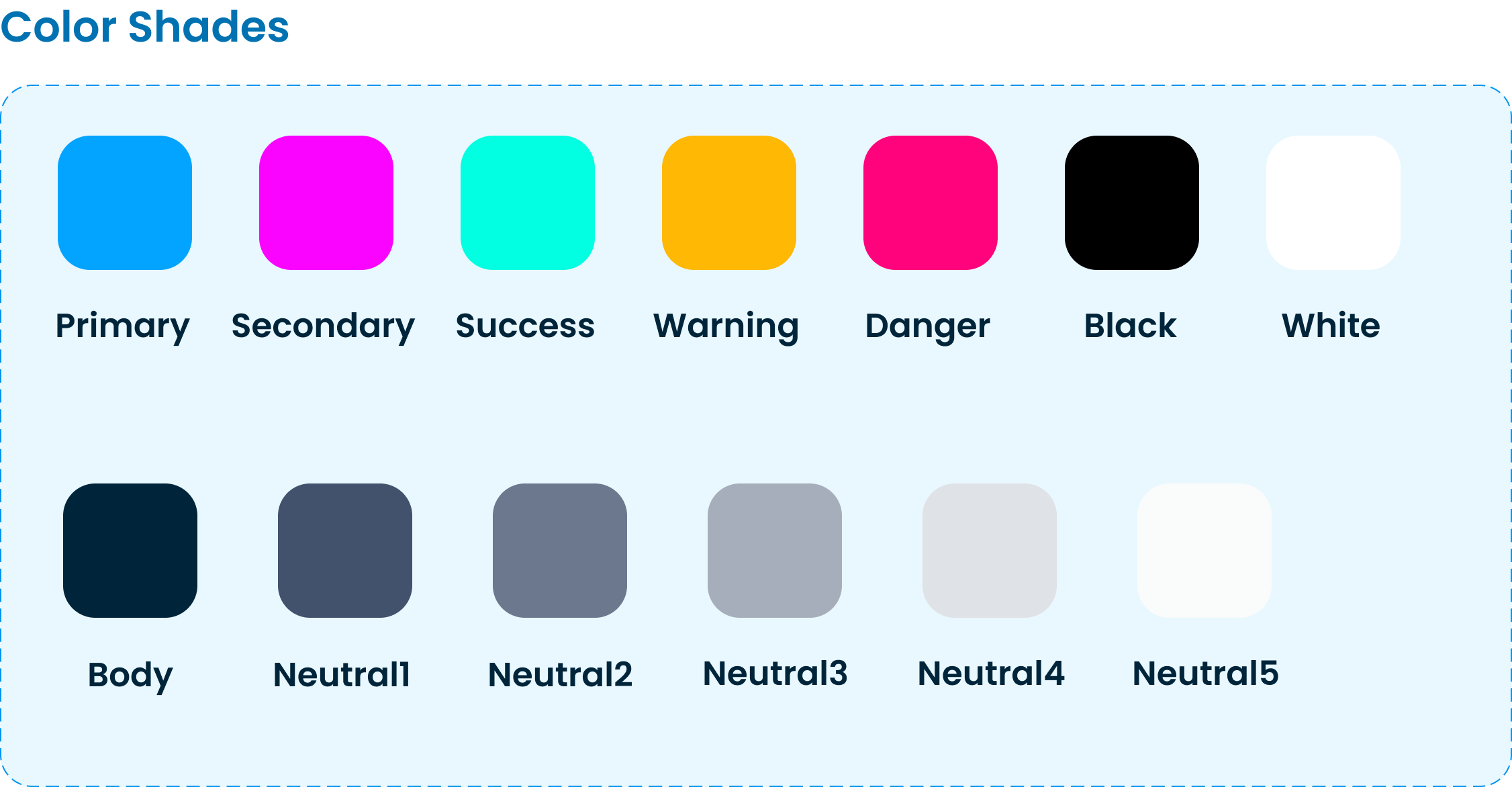
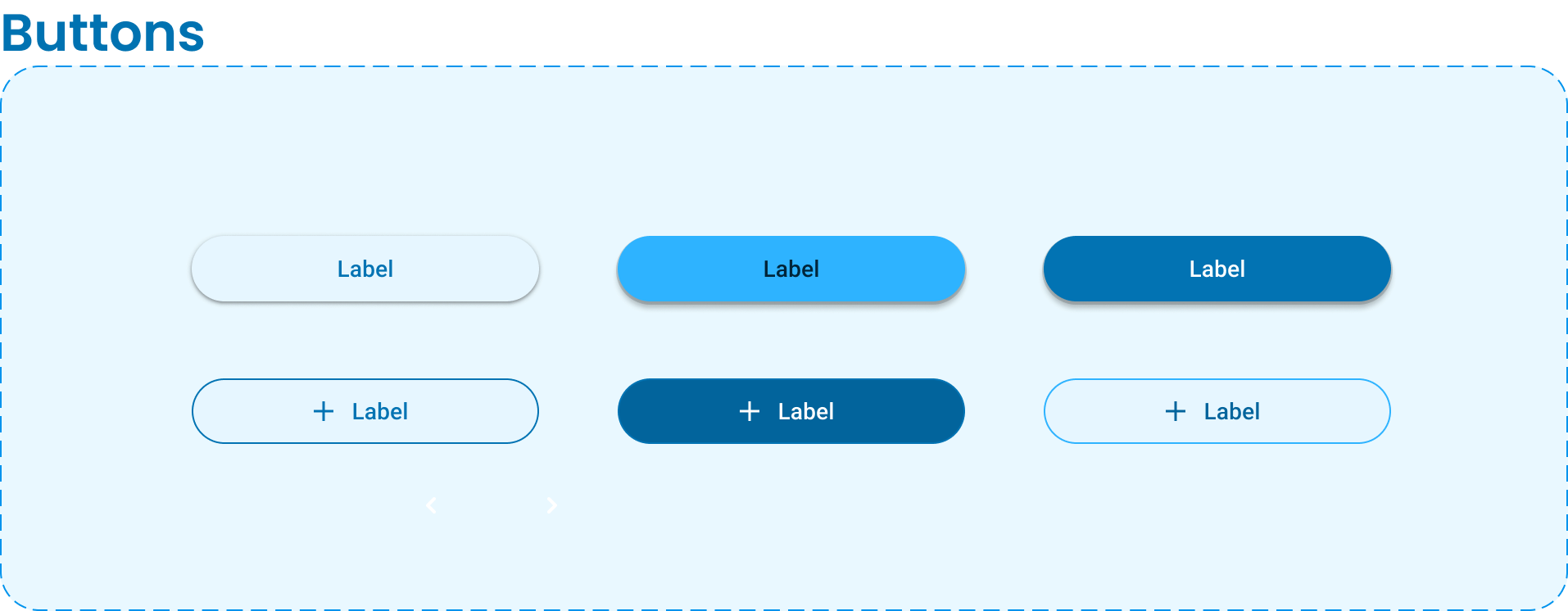
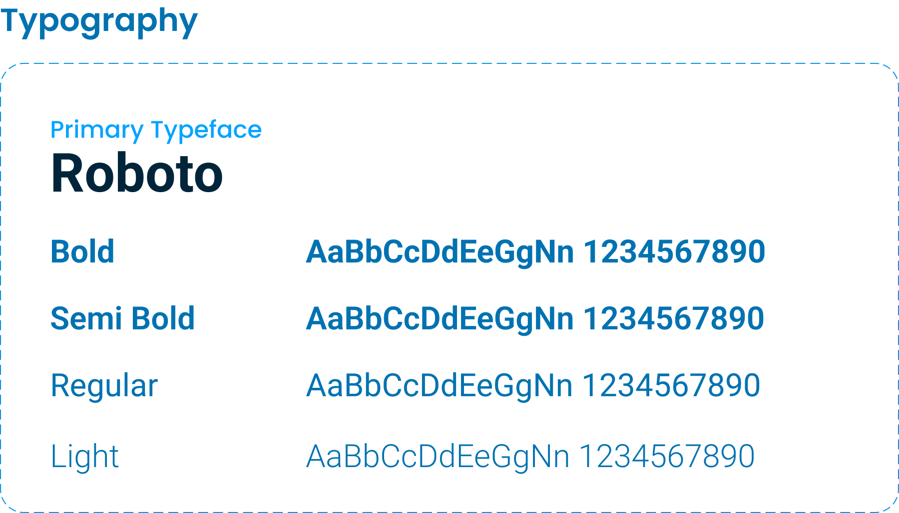
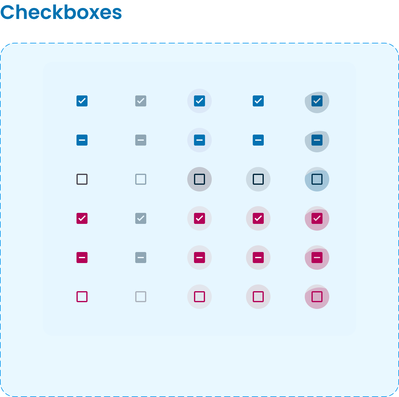
Design System (modified from Material Design)
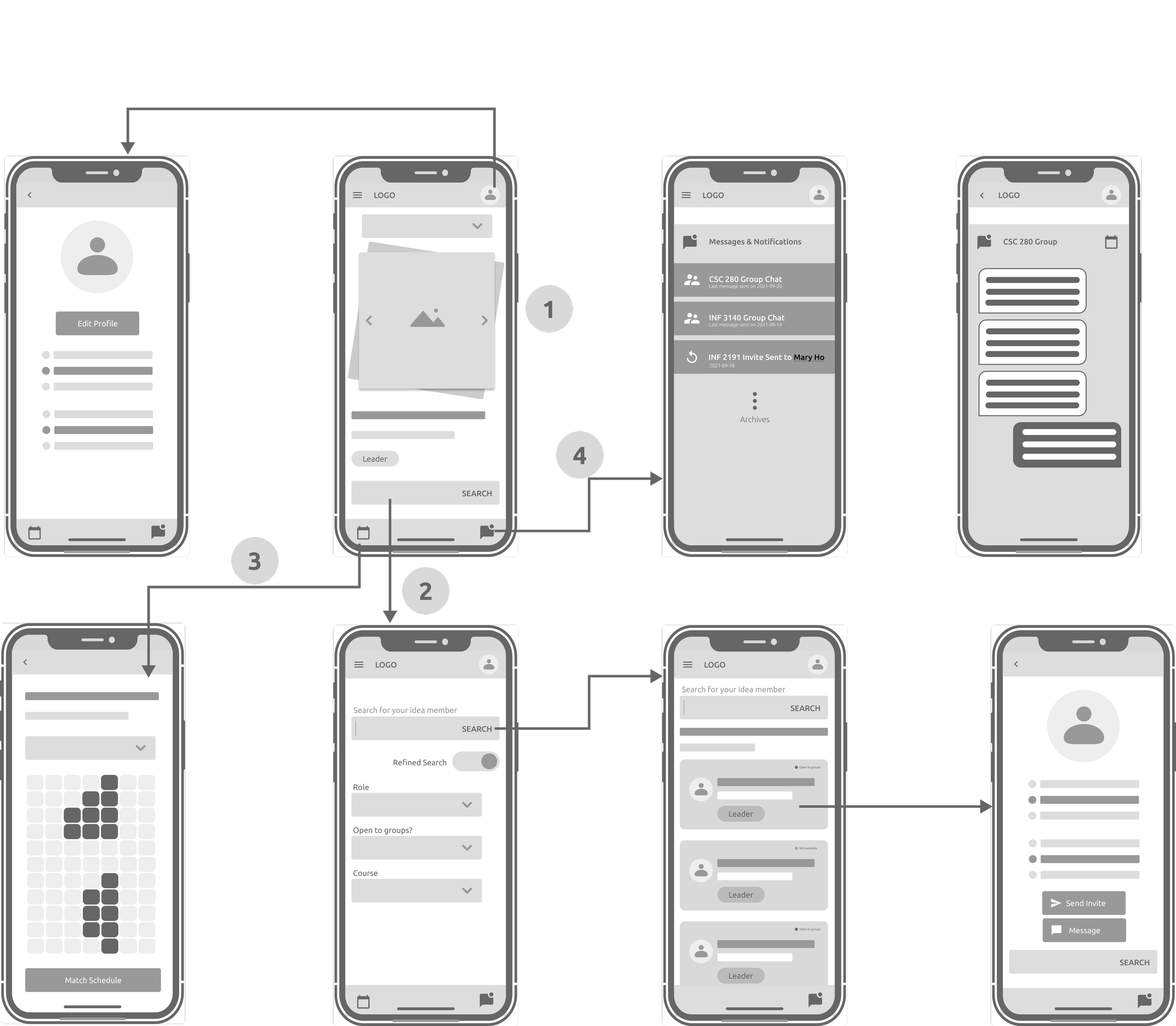
Mid-fi Wireframes
From the low-fi, we found out that there were a few “forward” and “back” buttons missing and users would prefer to use University-recognized verification process instead of simply giving the names.
We added the verification process and transferred the sketches into mid-fi wireframes. Mid-fi wireframes allowed us to better visualize the layout and the overall functionalities.
4 main functionalities denoted in the wireframes:
Swipe and Match
Search for available people
Match Common Schedule
Form Groups
Usability Testing
32
Participants
Testing
5
Follow-up questions
Have the search bar on the top.
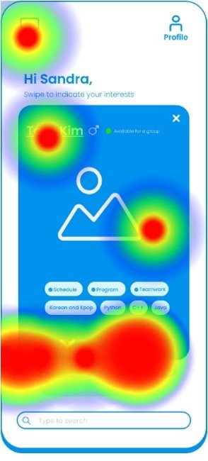
When asked to search for people / courses, participants were lost on the home screen. The original search bar was too small and in the bottom.
3
Tasks
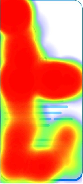
Before moving on to the final high-fi prototype, we tested a draft high-fi to see if design elements and user flows are intuitive. The heat maps below showed the confusion participants had with the draft high-fi screens.
Issues Identified and Enhancements
Add more visual clues to inform users how to swipe.
When asked to search for people / courses, participants were lost on the home screen. We decided to move the search bar to the top of the screen to make it more visible.
Make the schedule feature on a separate tab.
When asked to check the schedule or common availability on the personal bio page, users were clicking everywhere on the screen. We relabelled the button and make it a separate tab since it is an important feature.
Reflections
Future Enhancement
Restructure the teaching content with the integration of Nest
Explore what kinds of online activities can help students better interact with others online
Learnings
An UI design alone won’t solve all the problems. Sometimes, the UI has to be paired with other aspects of improvements (i.e., policy, management).
Reviewing primary research materials is essential for an industry that I’m not familiar.
Always go for evidence- and research-based design decisions.

