TD Virtual Queuing System
Enabling personal bankers to line up anytime, from anywhere during the pandemic.
Timeline
September 2020 - April 2021
Team
3 UX Designers, 2 Front-end Developers, 1 Ergonomic Engineer
Tools
Figma, Miro
My Role(s):
User research, Mock-ups design, team communication
Shipped the product by collaborating with the developers and accessibility specialists
My Contribution
The Background
The COVID-19 battle unleashed the enactment of social distancing bylaws
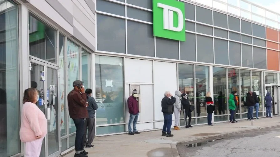
On March 17th, 2020, Ontario went to its first lockdown to combat the pandemic. All the public service should follow the social distancing policy enacted by the government of Ontario.
The Problem
How might we enhance the elder customers queuing experience while ensuring their health and safety?
However, this policy put challenges on the banks where people experienced longer wait time or long line. Many customers were turned away. The design research team was aware of this problem and wanted to collaborate with the accessibility team to build a solution to alleviate the long line-up problem. This was particularly a problem for the elder, because they were the ones that needed to come to the branch in-person and also at higher risk to get Covid. So the problem became, how might be enhancing the line up experience for the elder so that we could make sure their health and safety were taken into consideration?
The Solution
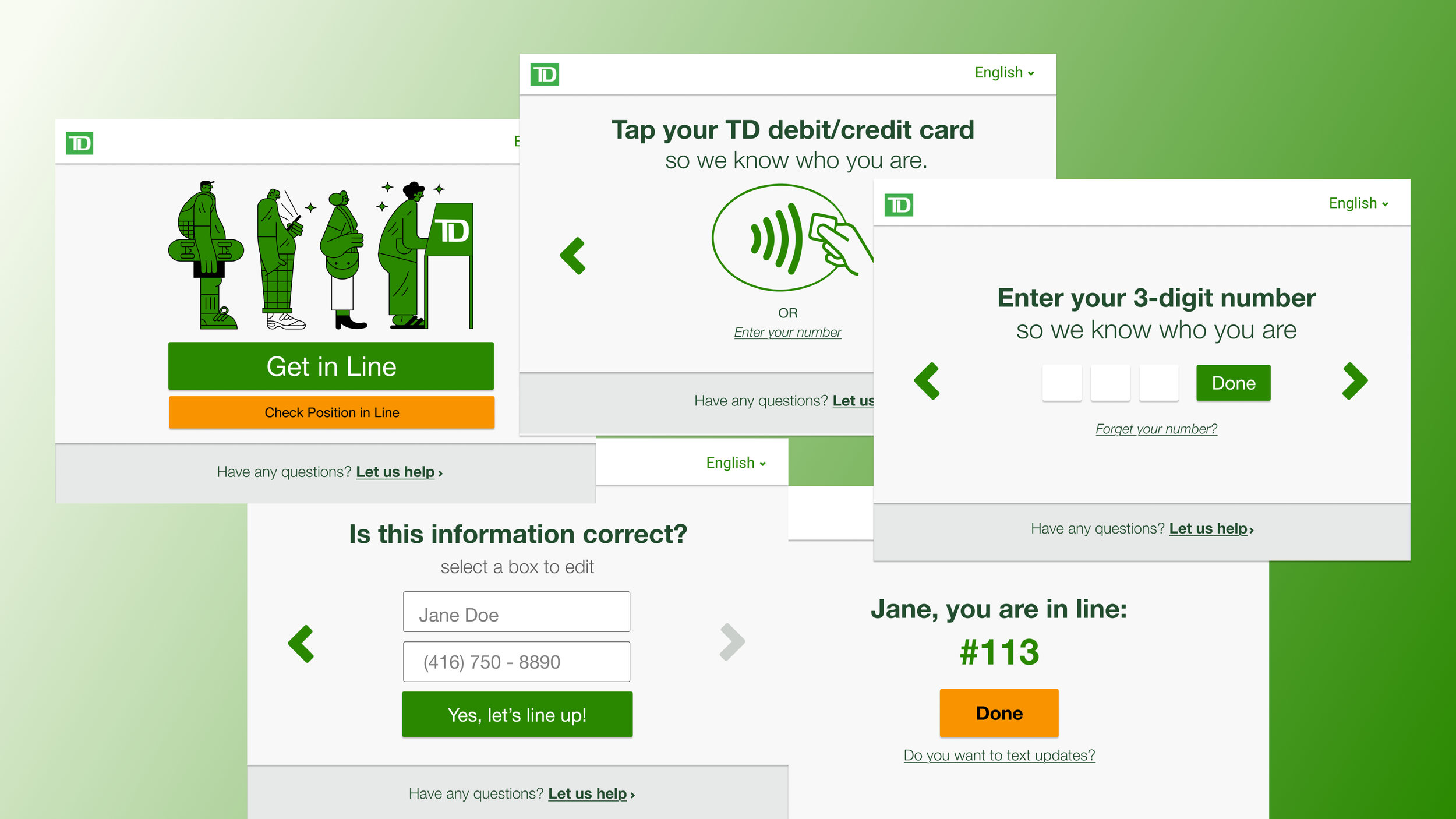
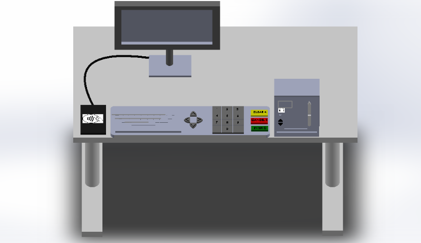
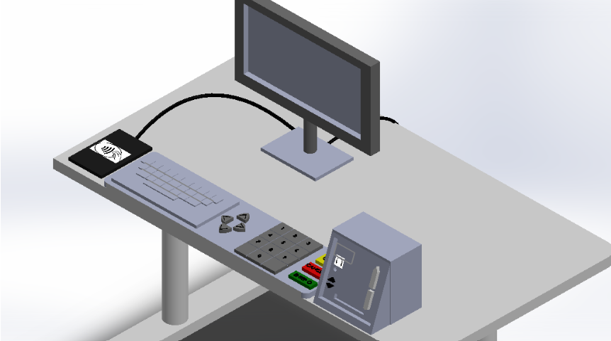
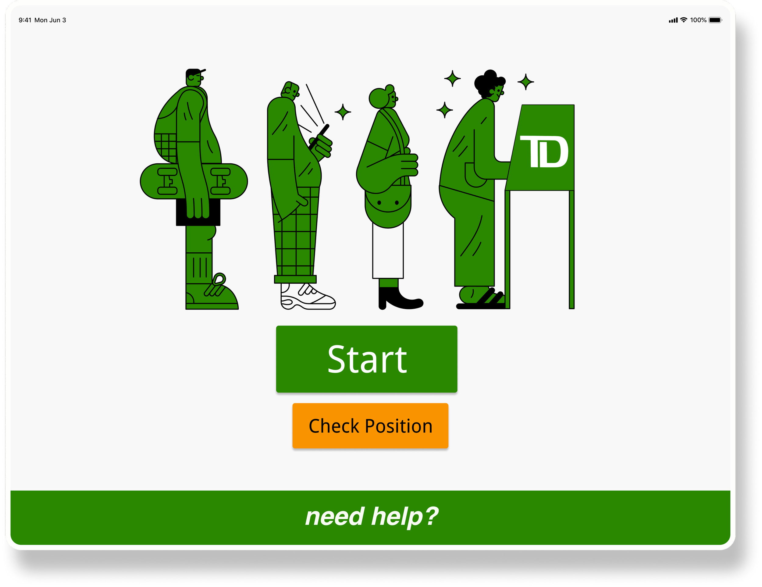
The birth of the accessible line-up kiosk
Overview of how the user interface on the kiosk works
Want to play with the real system? Click the button below!
The Team
Leveraging skillsets from a cross-functional team across Canada
Research
Site Observation
We observed how people line up at the branch and what the challenges would be
There is no clear sign to direct customers.
Customers need to keep social distancing.
Long line-up turns customers away.
The current line-up system is not accessible.
The branch manager told us that elder customers who are not familiar with how branch works need a sufficient amount of directions
Especially, elder customers are the ones that are at the high risk of getting COVID, so they have the most concerns lining up among the crowds
The current line-up system requires a cell-phone to receive text message updates, while the elder mostly struggle using a phone
Most of the time, when customers saw the long line-up in front of the branch, they were already discouraged
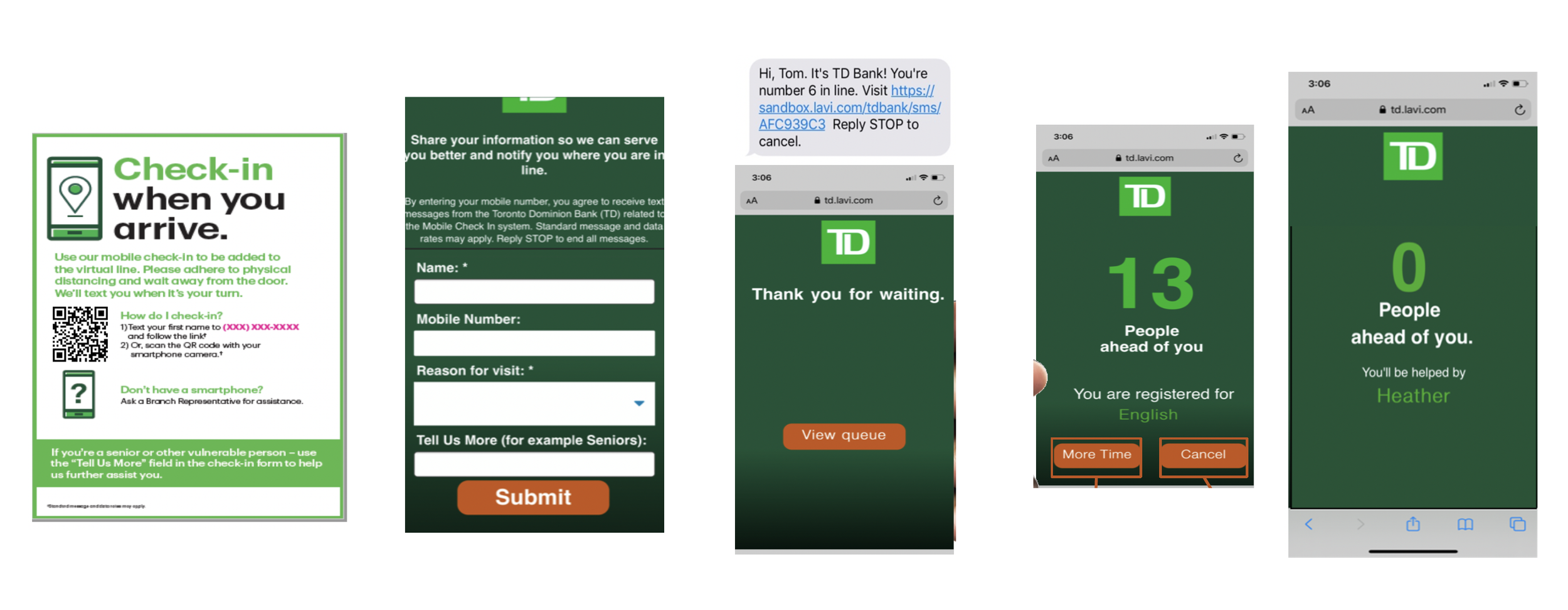
Current Product Assessment
The current queuing system has accessibility issues
The color contrast between the text and the background is too low
The current system requires a phone in order to line up, which is not accessible for people without phones.
This signage could not be easily discovered by the customers, and many did not know they could virtually line up.
Accessibility Research
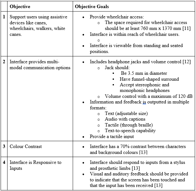
We conducted research on types of disabilities to consider and the accessibility guidelines
Types of disabilities to be considered
Auditory
Cognitive
Physical
Learning
Speech
Visual
Relevant accessibility guidelines (WCAG2.0)
Perceivable - orientation, use of color, color contrast, resize text
Operable - no keyboard trap, proper timeouts, target font / button size
Understandable - abbreviations, reading levels, error identification
Robust - compatible with different devices, status messages
User Interviews
We asked TD customers about their current line up experiences
We conducted interviews with 10 TD customers across different branches, including locations in Toronto (downtown and mid-town), Thunder Bay, and Vancouver. During these interviews, we inquired about their observations regarding the social distancing policy, their recent queueing experiences, and their firsthand experience with the existing virtual queuing tool.
-
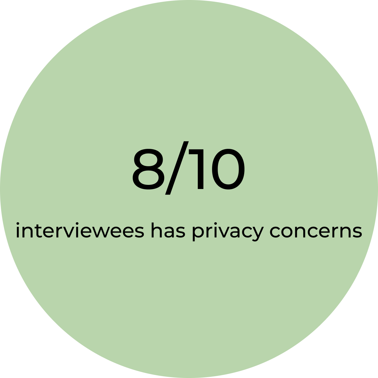
Participants were reluctant to put in their personal information to line up, because they would not trust the system.
-
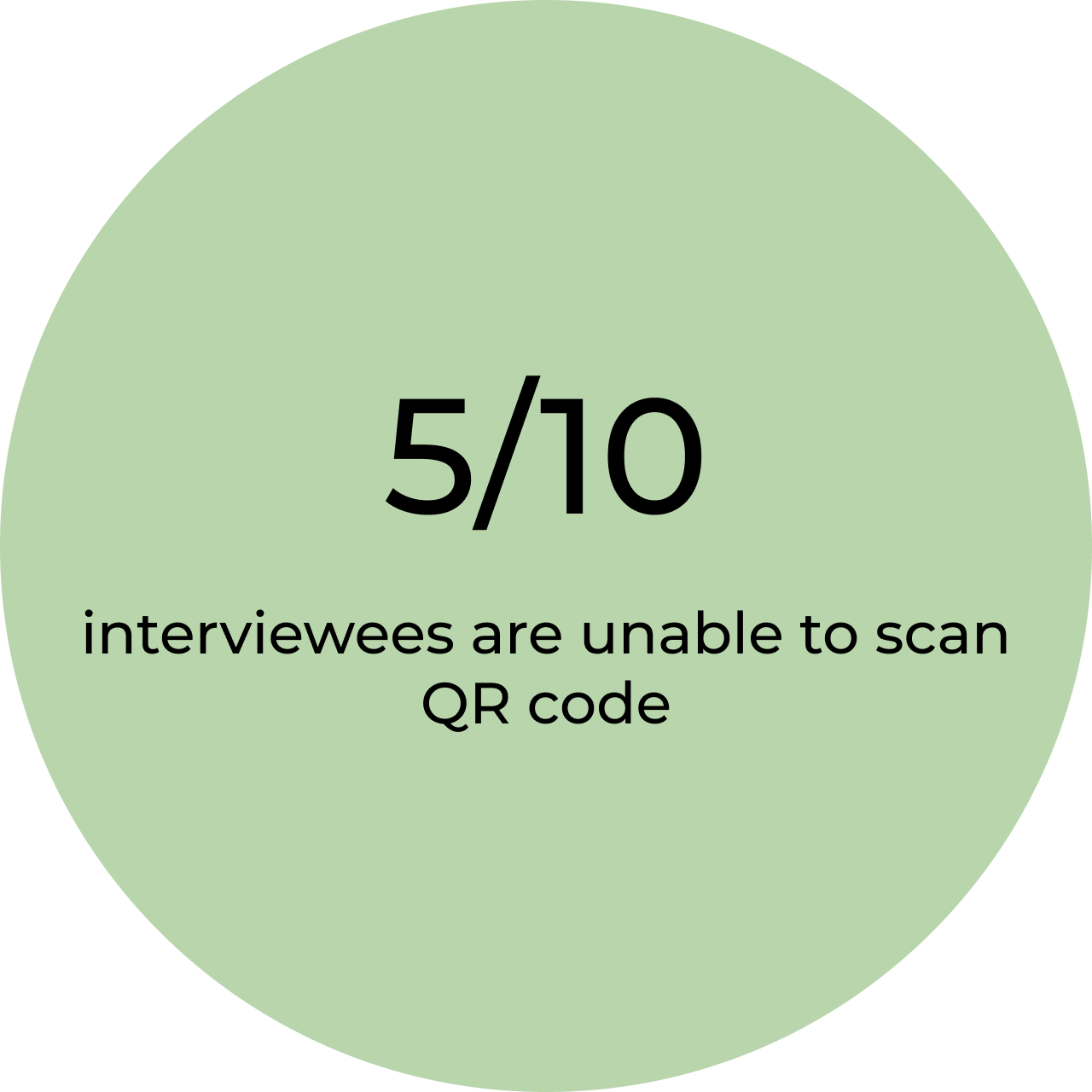
Some participants were unable to receive the text updates, while others complained they were unable to scan the QR code.
-
Participants mentioned about the competitiveness of this virtual line up product — most customers would just make an online appointment instead of coming to the branch to line up.
Define
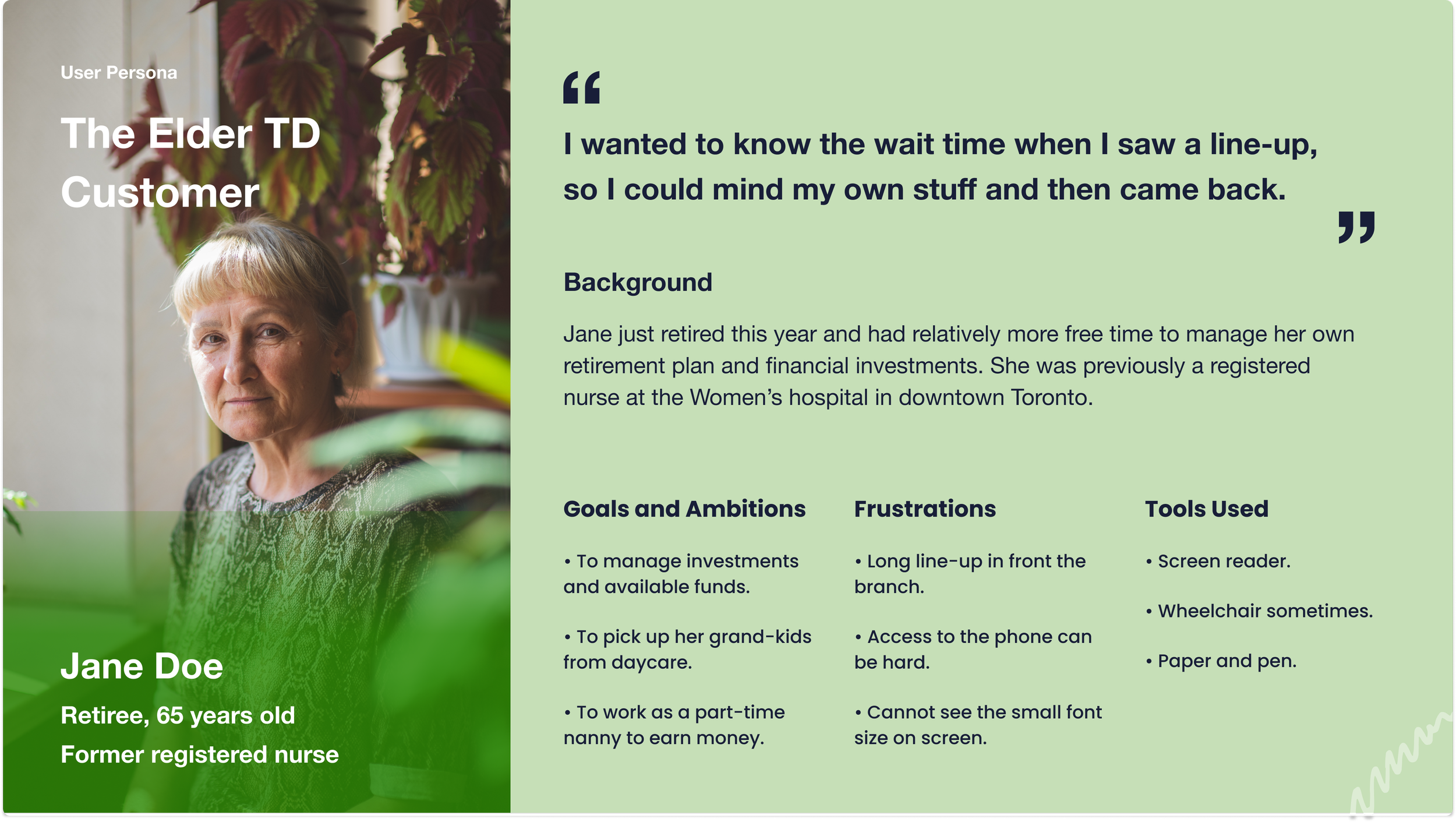
User Persona
We decided to target the elder customers with accessibility needs
Following our research data analysis, we found out that the primary pain points predominantly affected the older user demographic, particularly those with accessibility needs. The rationale behind this finding is as follows:
The younger generation exhibits greater proficiency in utilizing digital technology, enabling them to easily schedule virtual appointments online, rendering our intervention less necessary for them.
Even among younger individuals with accessibility needs, many already have assistive technologies, such as screen readers, integrated into their mobile devices. Consequently, they do not necessitate extensive redesign efforts on our part.
If our product is inclusive enough for the elder, it will also be accessible for the general public.
Besides, it is noteworthy that the elderly population constituted over 50% of the branch's customer base, and they frequently visited the branch and spent time waiting on-site.
Ideation
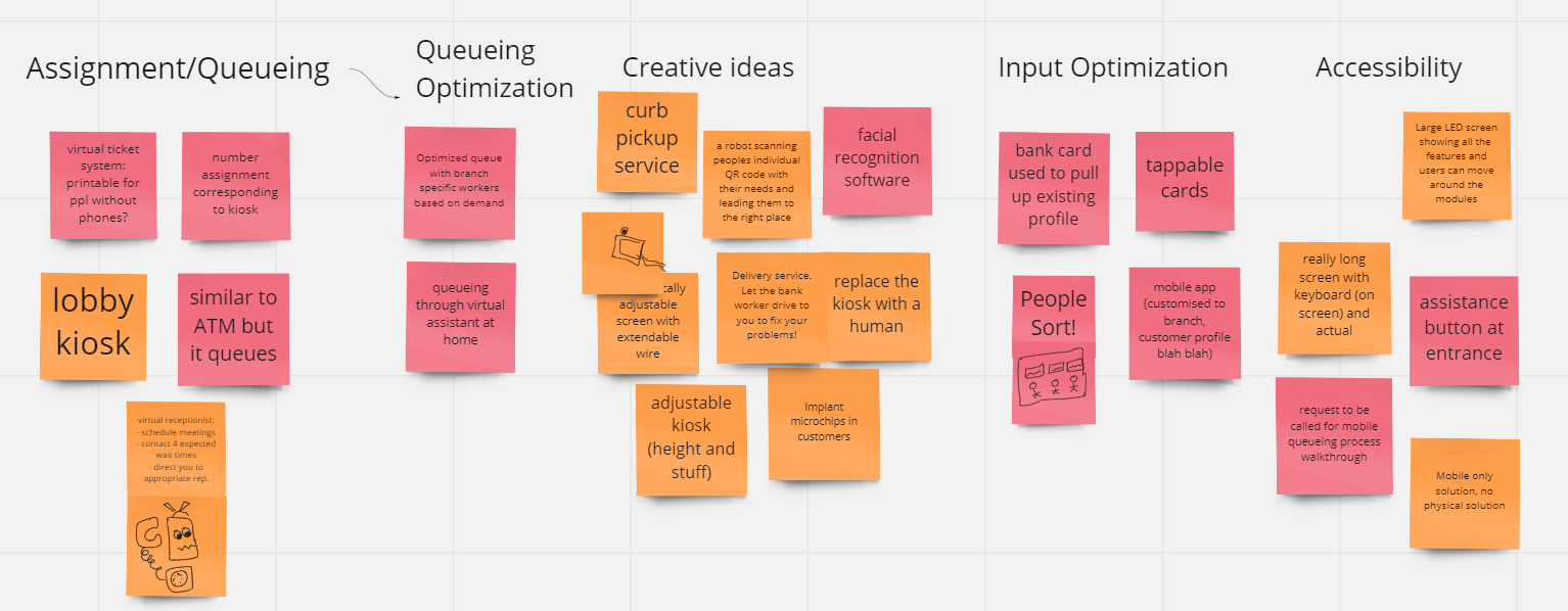
Brainstorming
How might we streamline the line-up process and make it accessible for the elder?
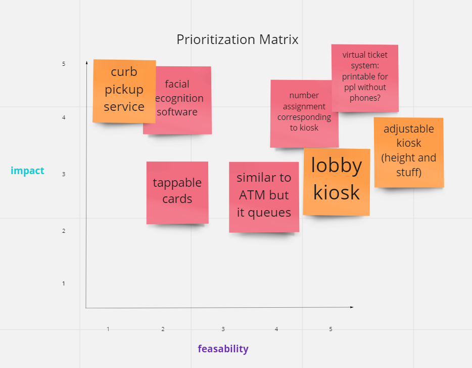
Prioritizing and Refining
Elder customers can line up in a more accessible way through a kiosk
Finalizing the idea
How will this design help the elder and people with disabilities to line up?
We decided to build:
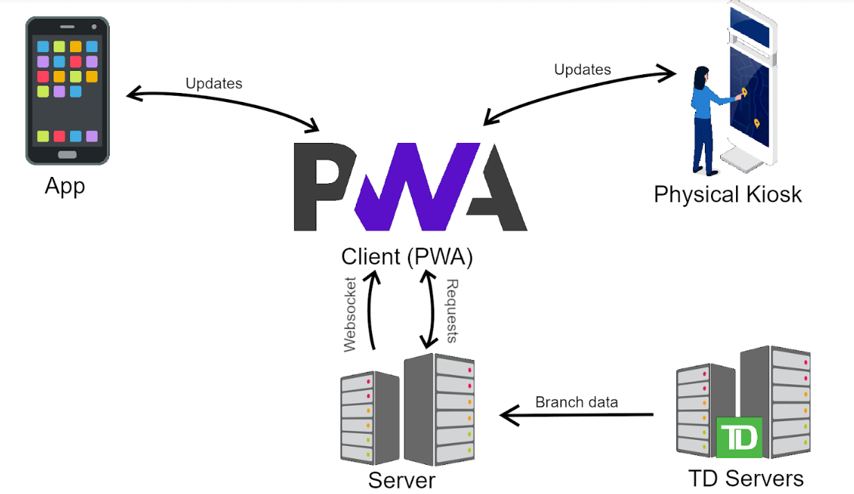
A virtual system where elder customers can line up, get the updates of the queue in a quick and accessible way and get directed once at the branch.
A physical kiosk that is accessible to all kinds of users (e.g. wheelchair)
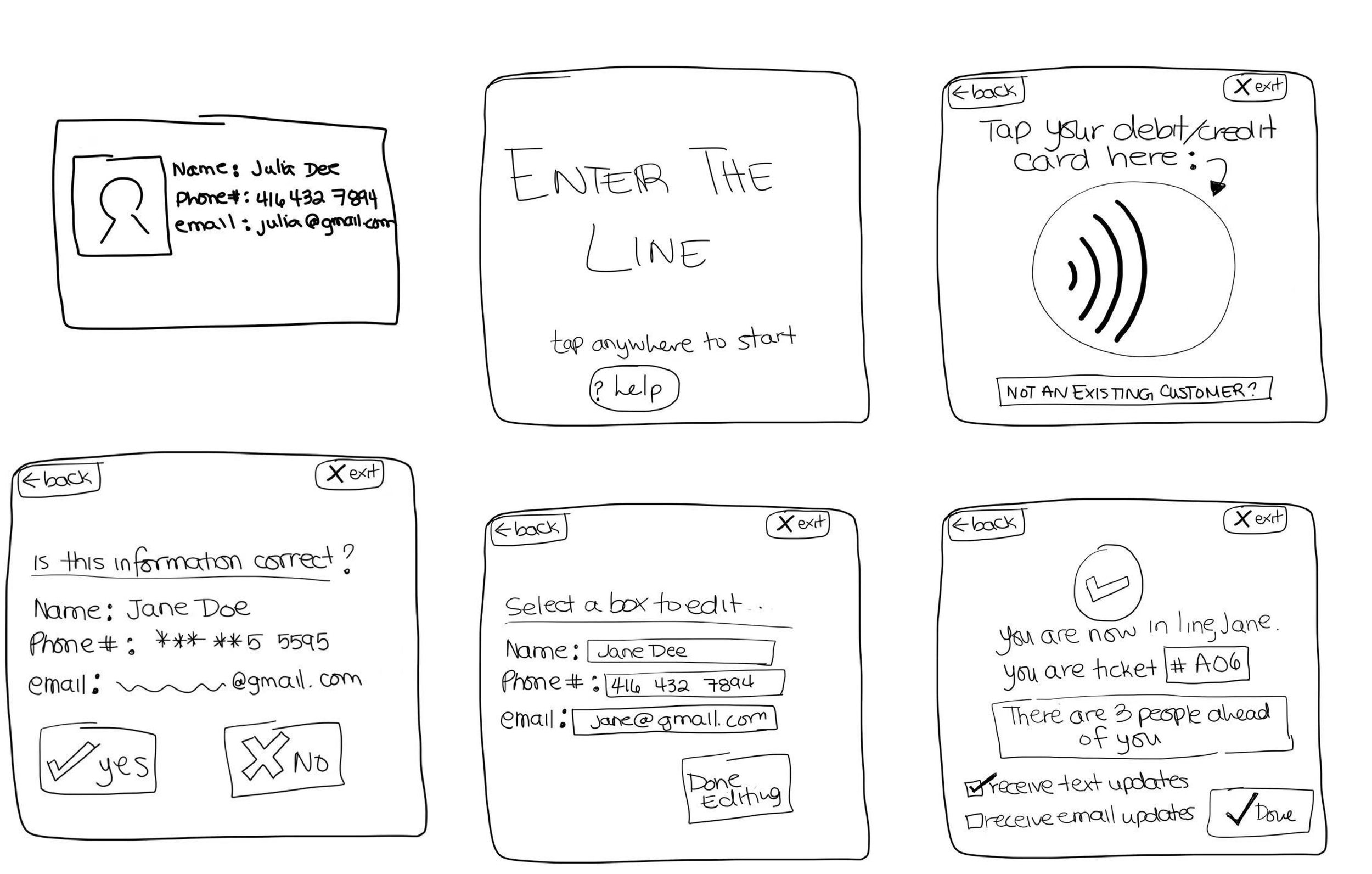
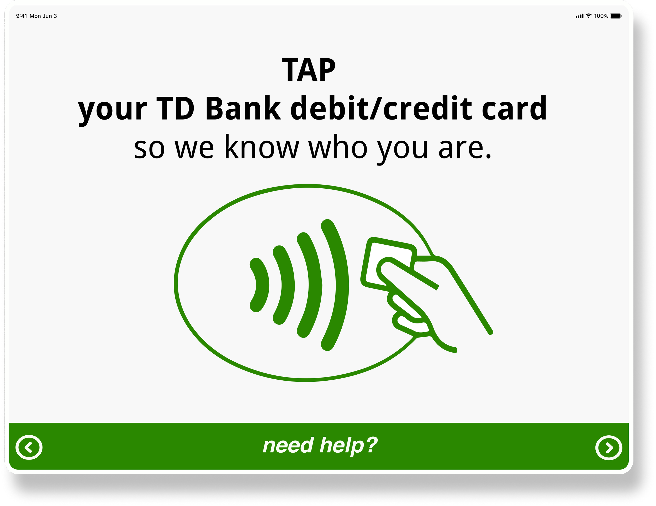
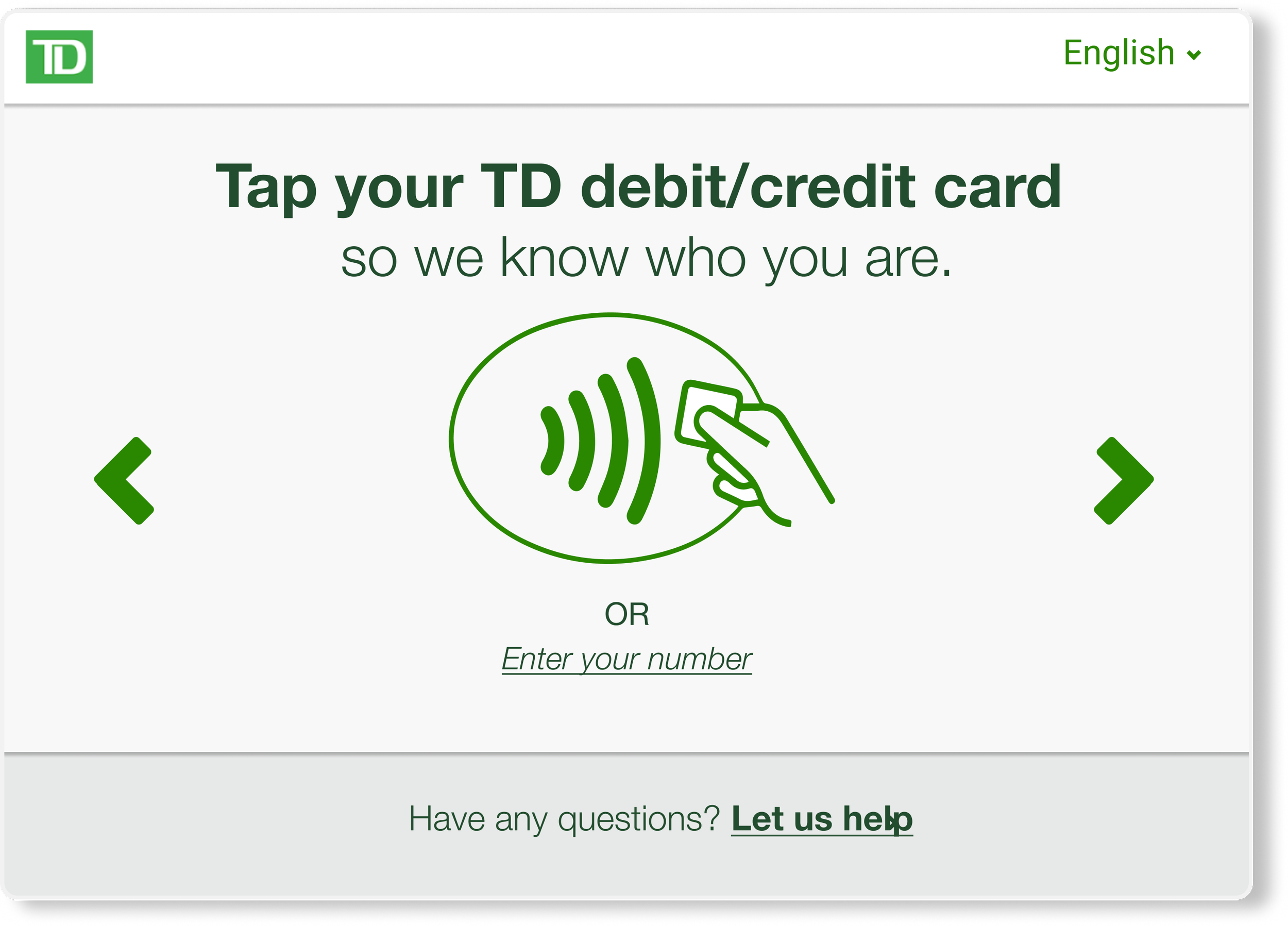
Have users tap the bank card to automatically line up
Provide users with estimated wait time in line
Direct users to specific counter based off their needs
Design
Initial Sketches
What could it look like?
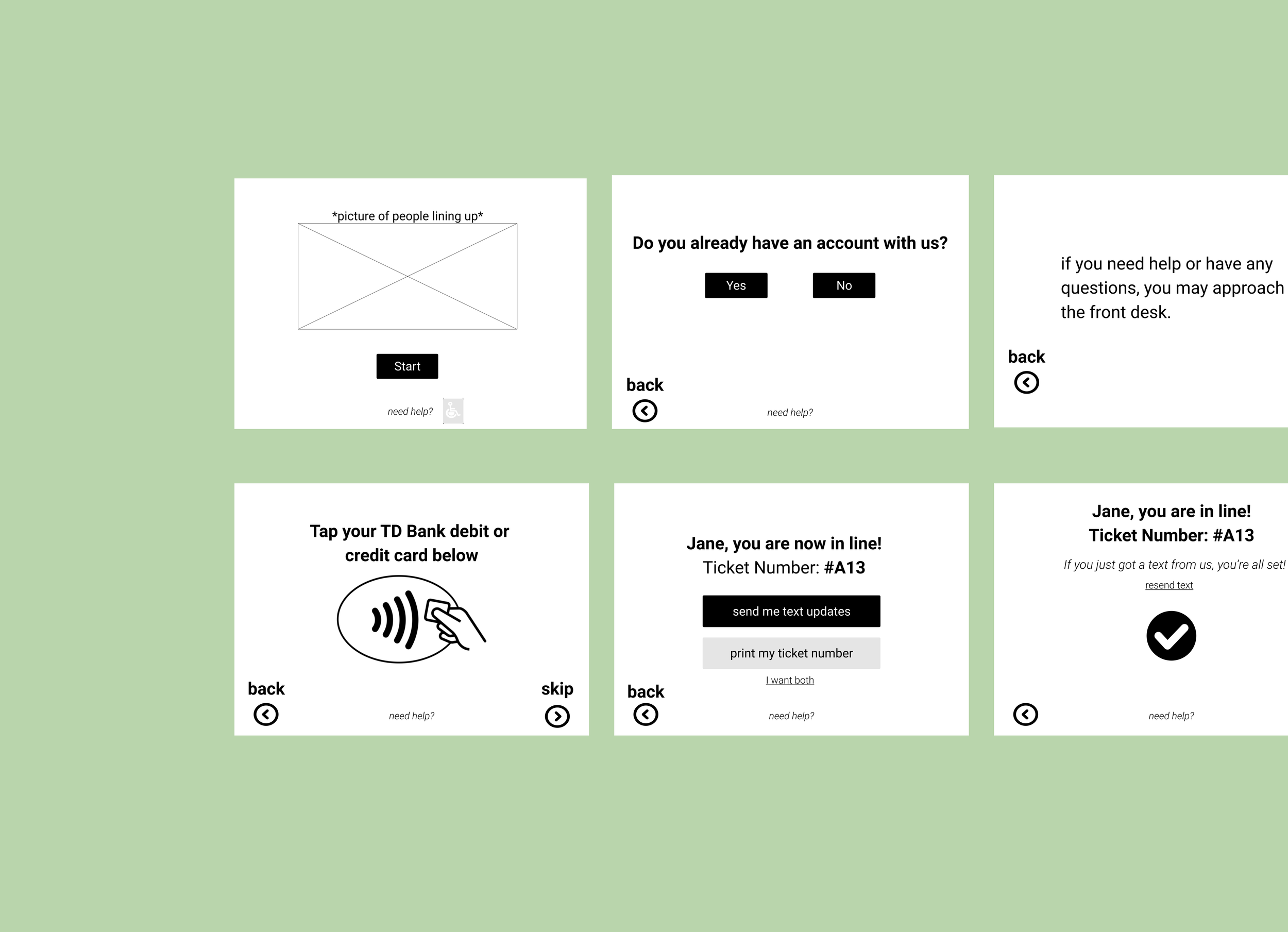
One step further
Something like this?
Make sure the color contrast is at least 4.5 :1 between the text and the button color & buttons and the background color
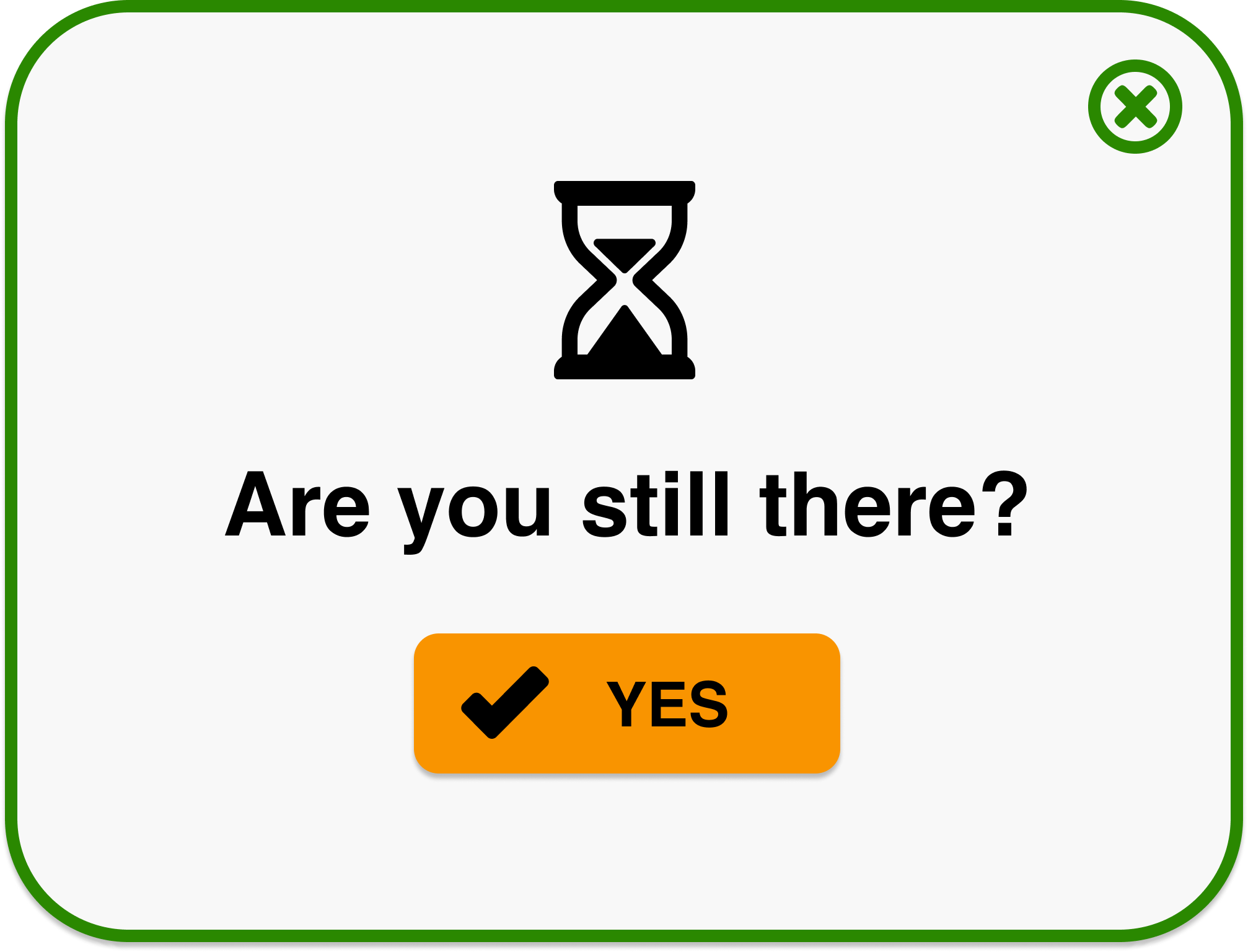
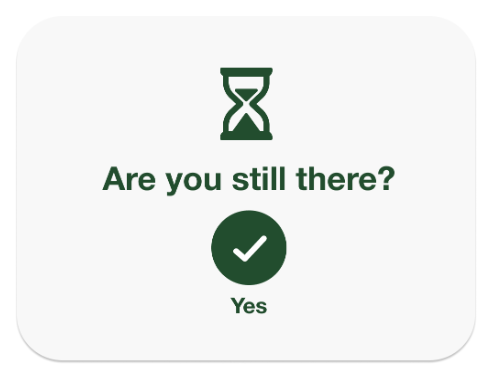
Have time-out screen to protect customers’ information
Add help button across the screens
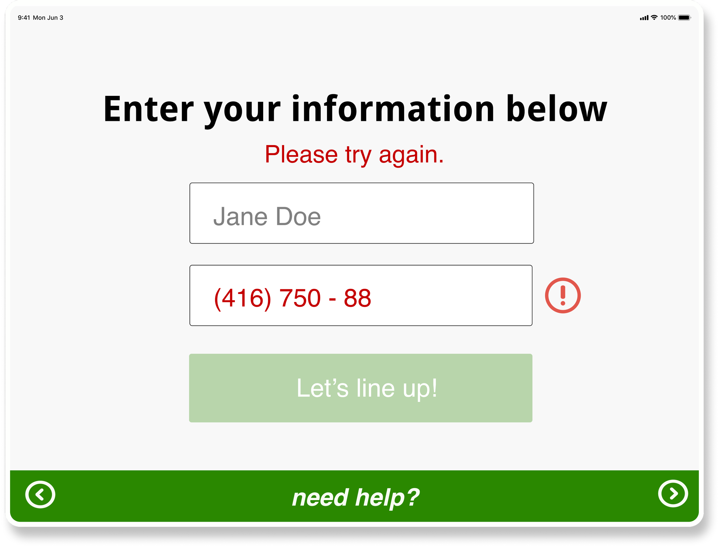
Show error message if information is entered in a wrong format
Test
Enhancements
How can we make it more accessible?
Enhancement 01
Increase the size and adjust the color
Adjust the color to increase the contrast rate from 4.5:1 to 9.6:1
Increased the duration of the time-out to accommodate people with cognitive disabilities
Enhancement 02
Provide the option to manually enter info
10/10 users were uncomfortable tapping the card due to privacy concerns
Added the option for users without the phones to manually enter the information
Enhancement 03
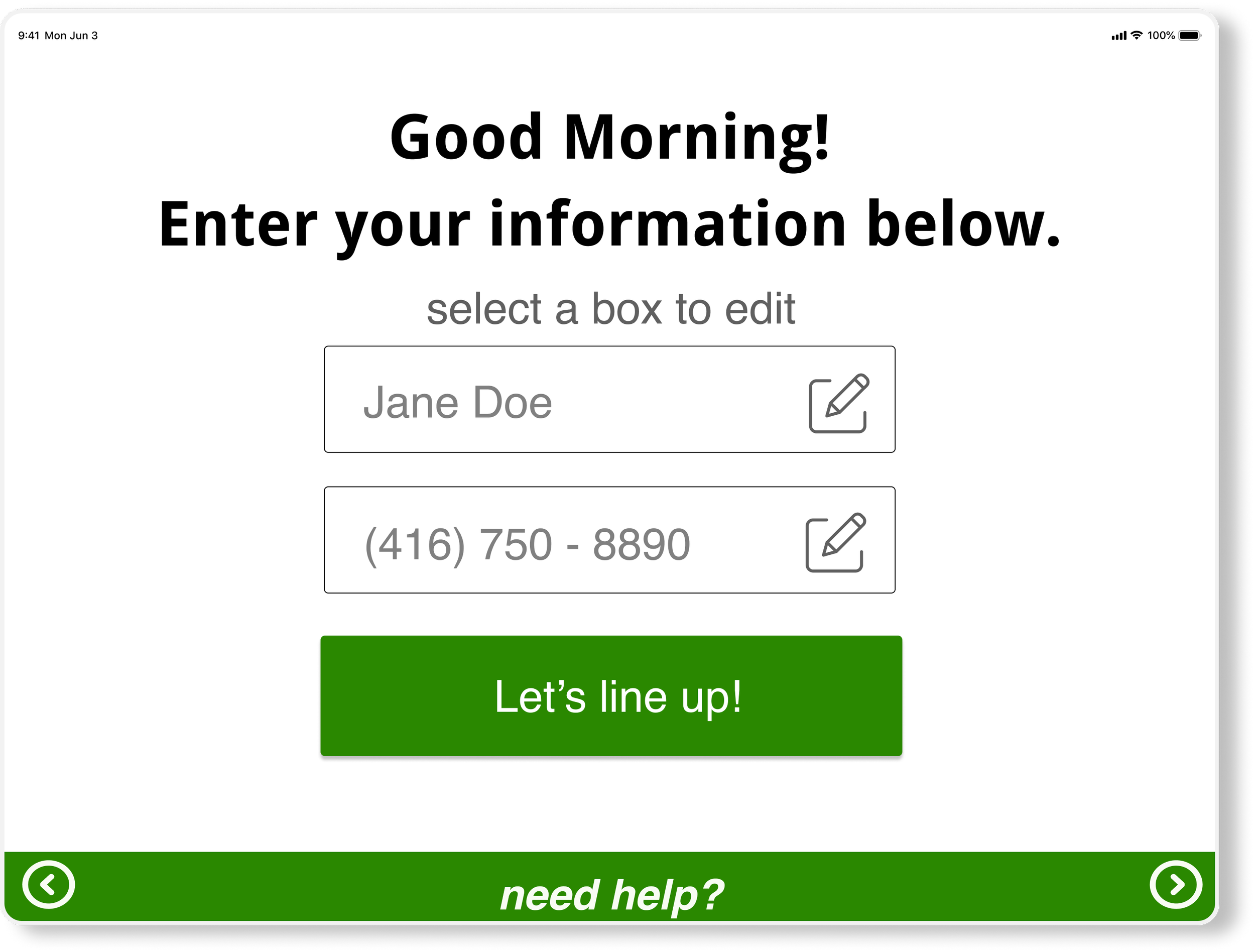
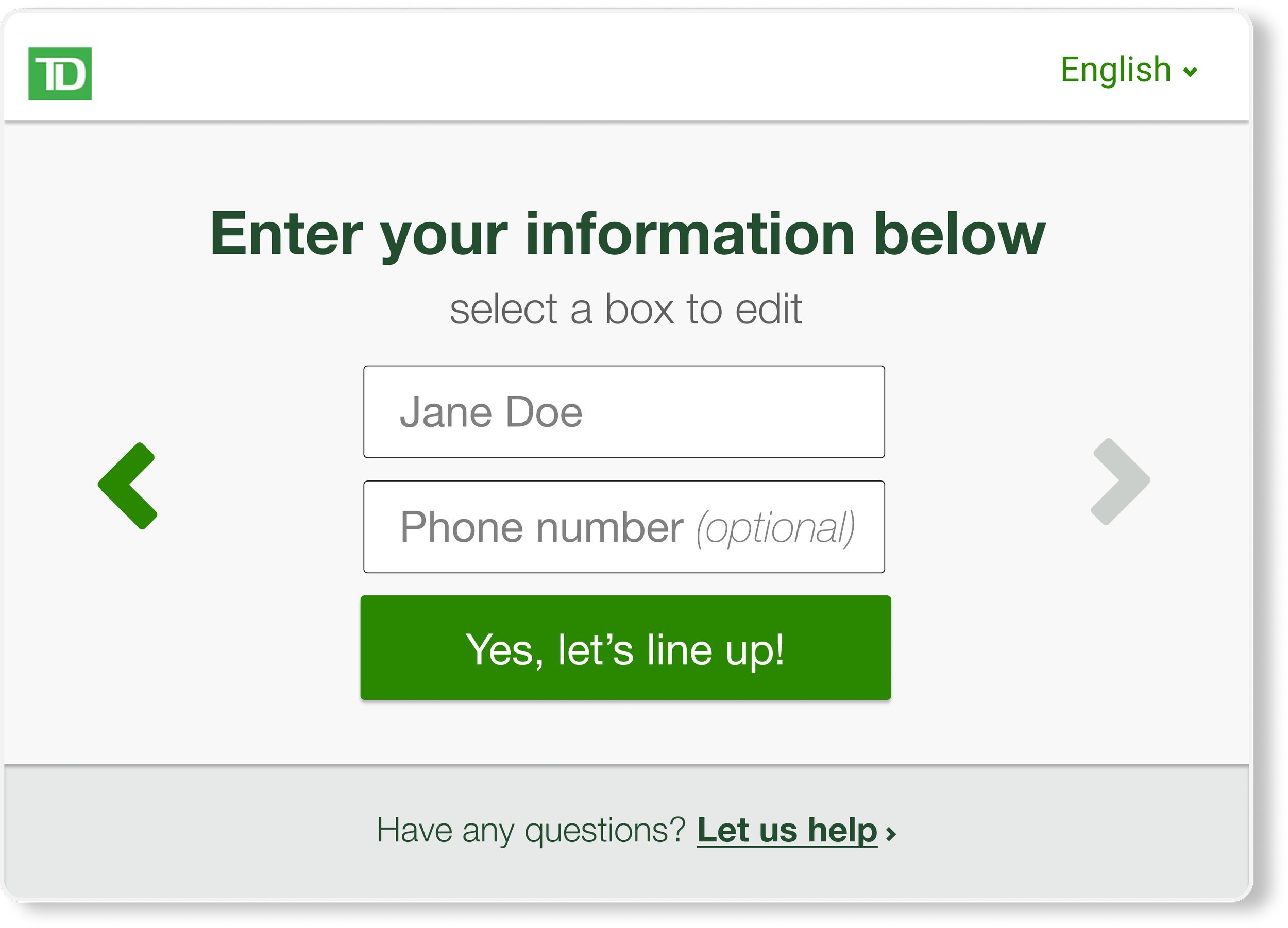
Have phone number field as optional
6/10 users were concerned about not having phones with them
Instead of asking them to enter phone number, we made it as optional so that users can print out the ticket number
Enhancement 04
Add an universal help button
Participants were still concerned if they had any issues with the machine and the interface
The help button directs customers to the front desk where a representative can answer their questions
The Outcome
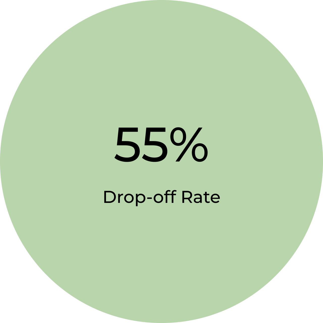
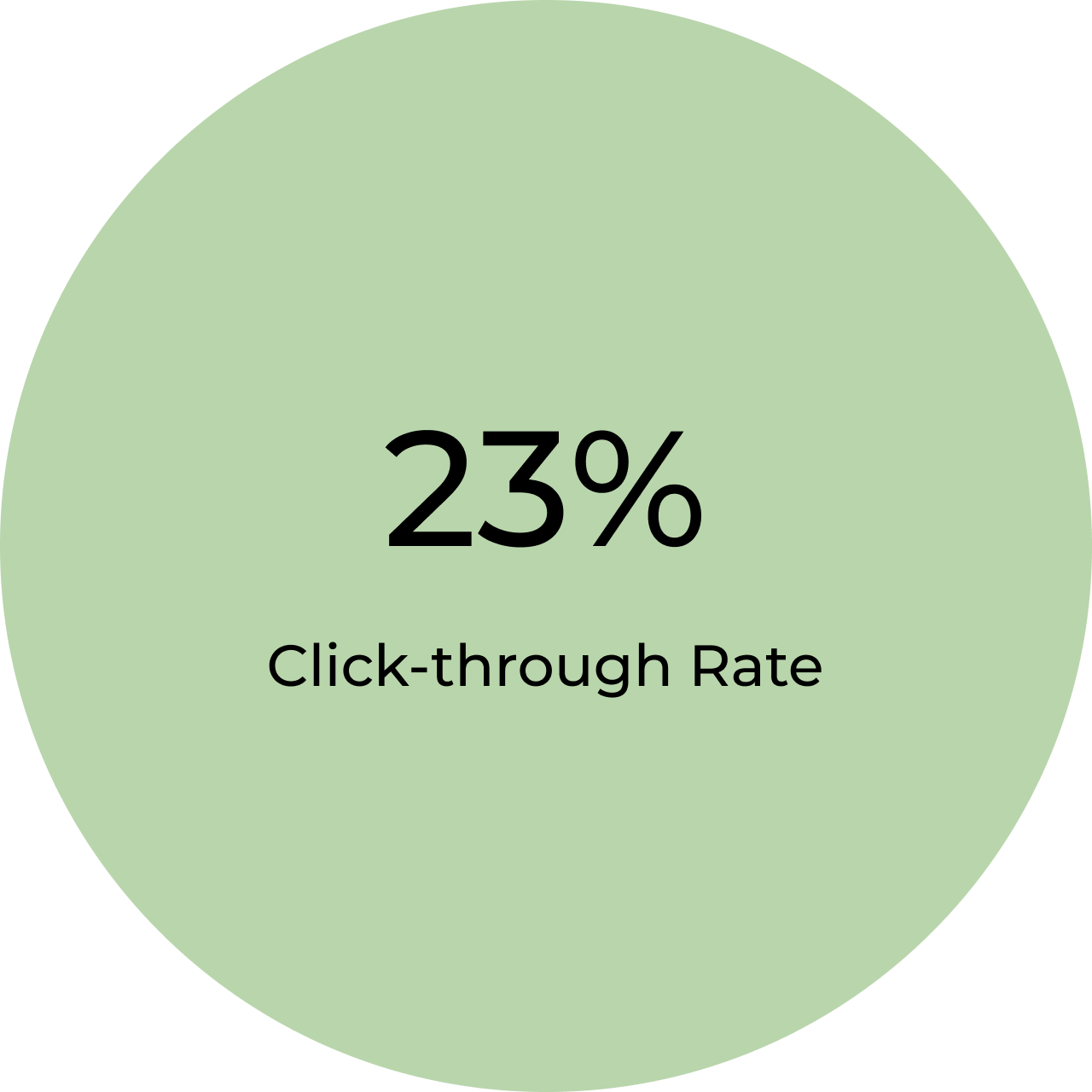
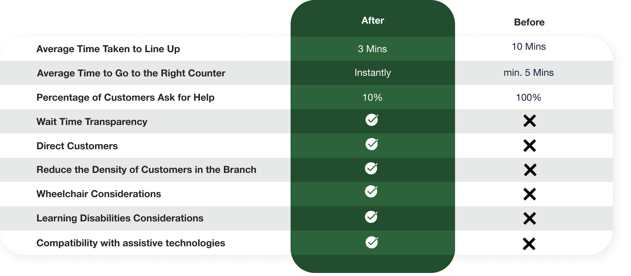
Significant reduce in wait time and length of line-ups
The graph shows the before and after stages of using the virtual queueing system. Before stage data comes from our observation at the Toronto downtown branch which might not be applicable for branches in other areas. However, the data still shows the effectiveness of having a virtual queueing system or a kiosk during a busy time.
Reflections
Collaborated and worked with a cross-functional team for the first time
I worked with developers, TD clients, banking managers and accessibility teams closely for the very first time. I learned how to communicate the design accurately with different stakeholders and how to properly leverage knowledge from different program areas. I also learned I can’t expect everyone to be in the similar mindset as I am so I have to constantly present my ideas and show the reasoning.
Communicated business requirements and customers’ needs accurately
Sometimes the developers and engineers on the team could not understand the importance of being user-centric so they sometimes devalued the design or underestimated the work, but I learned how to communicate the user needs to them in a better way so that they understood more about user-centric approach.
Should conduct more research on the accessibility and different kinds of disabilities
The project took place during the pandemic, so we did not get a chance to interview many people with disabilities and to observe how they accessed the branch. If I were to have more time, I would interview more people with disabilities and connect with the accessibility team more often to learn more about accessibility design.

